
Quantile-Quantile, more commonly known as the QQ plots is a powerful tool in statistics for assessing the normality of a distribution. The qqplot function in R, along with qqnorm and qqline, provides a versatile way to generate QQ plots and determine whether your data has a normal distribution. In addition, the ggplot2 package offers a more customizable approach to creating QQ plots. In this article, we'll go over the basics of QQ plots, the qqplot function in R, and variations such as qqnorm, qqline, and ggplot-based QQ plots.
What is a QQ Plot?
A QQ plot visually compares the quantiles of a sample data set to the quantiles of a theoretical distribution, usually the normal distribution. The x-axis shows the theoretical quantiles, while the y-axis shows the observed quantiles from the data. If the points in the plot are roughly aligned along a straight line, it indicates that the data has a normal distribution.
What are qqnorm and qqline?
Before diving into qqplot, let's explore the foundational qqnorm and qqline functions in R.
qqnorm Function
The qqnorm function is used to create a QQ plot for a given data set against the standard normal distribution. The basic syntax of qqnorm is as follows.
Code:
data <- rnorm(100, mean = 50, sd = 10)

qqnorm(data, main = "QQ Plot", xlab = "Theoretical Quantiles", ylab = "Sample Quantiles")
Plot:
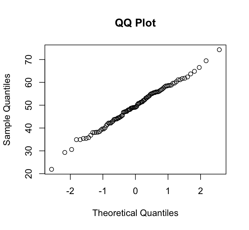
In this example, we create a random normal distribution in the "data" variable, which will then be used to make the QQ plot. The main, xlab, and ylab parameters are optional and can be used to customize the plot title and axis labels.
qqline Function
The QQ plot that we just generated contains segregated circular data points representing the individual data points. For better understanding, you may want to add a reference line to better assess the linearity of the points. The qqline function accomplishes this.
Code:
qqline(data, col = 2)
Plot:
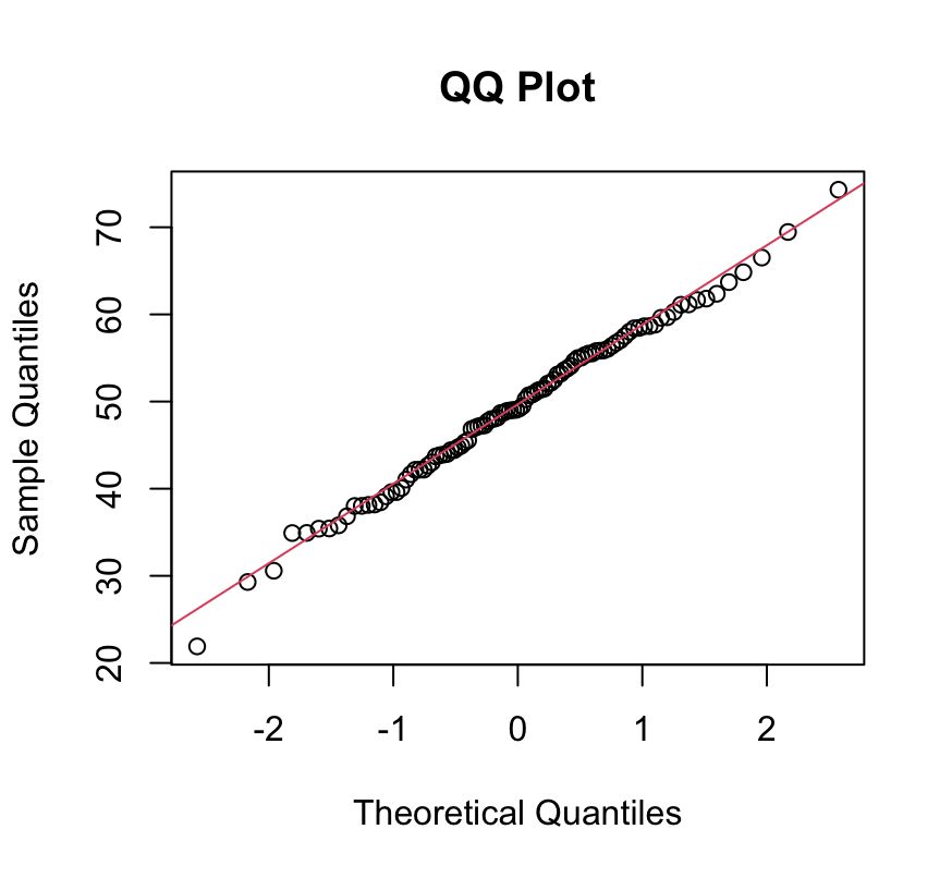
Here, 'data' is the same numeric vector used in qqnorm. The col specifies the color of the reference line, which by default is red.
The qqplot Function
The qqnorm and the qqline functions are both very useful for short and quick assessment of our data, but when it comes to deep and more informative insights, the qqplot function comes equipped with various tools, providing more flexibility and customization options to us.
The syntax of the qqplot is as follows.
qqplot(x, y, main = "QQ Plot", xlab = "Theoretical Quantiles", ylab = "Sample Quantiles", pch = 16, col = 2)
Here, 'x' and 'y' are the numeric vectors you want to compare. The main, xlab, and ylab parameters allow you to customize the plot title and axis labels. The pch parameter specifies the plotting character (default is a solid circle), and col sets the color of the points. You can learn more about pch here.
Let us now modify our first example to use qqplot function instead.
Code:
qqplot(qqnorm(data, plot = FALSE)$x, data, main = "QQ Plot of Data", xlab = "Theoretical Quantiles", ylab = "Sample Quantiles", pch = 16, col = 2)

qqline(data, col = 2)
Plot:
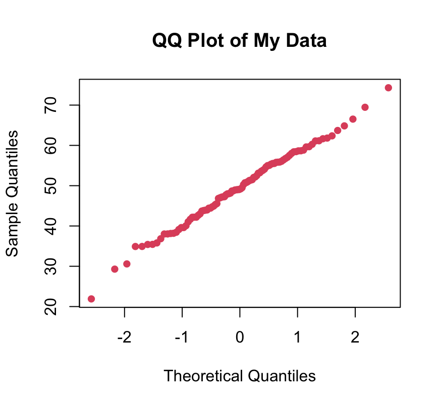
In this example, we use qqplot with plot = FALSE in qqnorm to obtain the theoretical quantiles without plotting them. This allows us to customize the QQ plot further using qqplot.
Enhancing Visualization with ggplot2
The ggplot2 package provides a more sophisticated and customizable approach to creating QQ plots.
ggplot2-Based QQ Plot
Creating a QQ plot with ggplot2 involves transforming the data into quantiles and using geom_point and geom_abline for plotting points and adding a reference line, respectively.
Code:
ggplot(data.frame(theoretical = qqnorm(data, plot = FALSE)$x, sample = data), aes(x = theoretical, y = sample)) +
    geom_point(shape = 16, color = "blue") +
    geom_abline(intercept = mean(data), slope = sd(data), color = "red") +
    labs(title = "ggplot2-Based QQ Plot", x = "Theoretical Quantiles", y = "Sample Quantiles")
Plot:
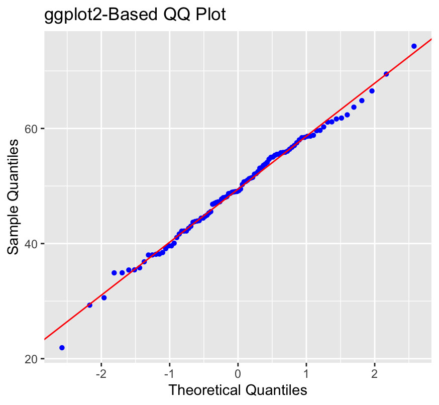
In this example, we use ggplot to generate a QQ plot by mapping the theoretical and sample quantiles to the x and y axes. The geom_point and geom_abline functions add points to the plot and a reference line, respectively. The labs function enables us to customize the appearance and labels.
Customizing ggplot2 QQ Plot
The flexibility of ggplot2 is what makes it so powerful. You can further customize the QQ plot by changing its parameters. For example, you can change the appearance of the points, add confidence intervals, or even change the axis labels.
Code:
ggplot(data.frame(theoretical = qqnorm(data, plot = FALSE)$x, sample = data), aes(x = theoretical, y = sample)) +
  geom_point(shape = 18, color = "green", size = 2) +
  geom_smooth(method = "lm", se = FALSE, color = "orange") +
  labs(title = "Customized ggplot2 QQ Plot", x = "Theoretical Quantiles", y = "Sample Quantiles") +
  theme_minimal()
Plot:
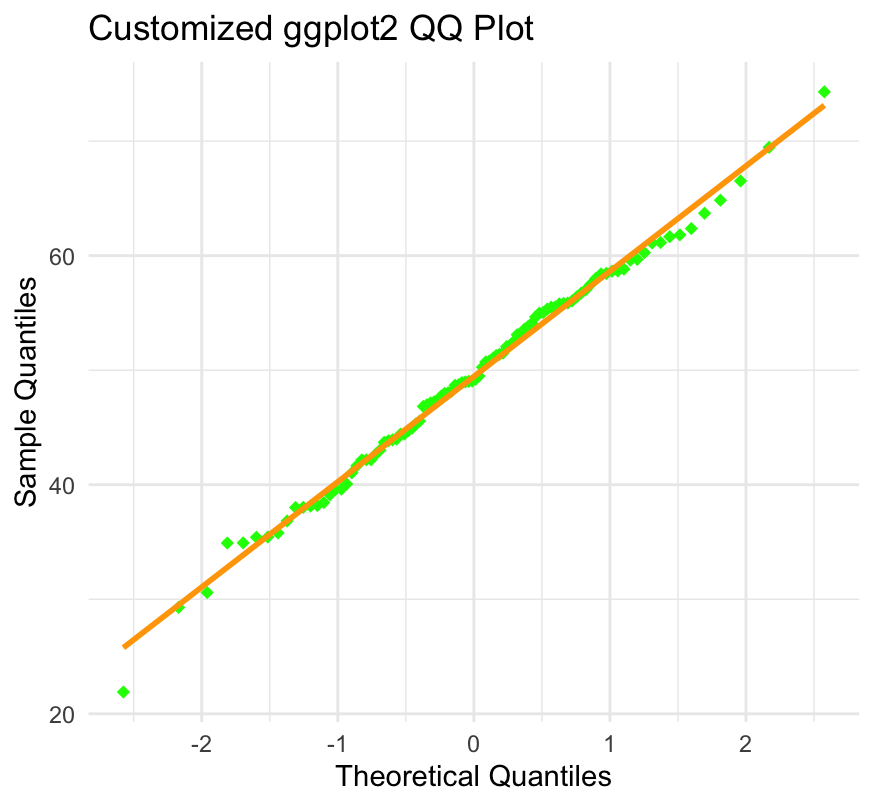
In this example, we use geom_smooth with method = "lm" to add a linear regression line without confidence intervals. The shape, color, and size parameters customize the appearance of the points, and theme_minimal provides a clean background.
Conclusion
QQ plots are useful tools for determining the normality of a distribution, and R includes several functions for creating them. The qqnorm and qqline functions are quick ways to create basic QQ plots, whereas the qqplot function provides more customization options. For those who want more flexibility and style, ggplot2 offers a powerful framework for creating highly customizable QQ plots. Whether you use base R functions or ggplot2 for QQ plots, understanding these tools is critical for statisticians, data scientists, and researchers alike.