
Data visualization is a very important part of data analysis. R offers an extensive ecosystem for creating engaging and informative graphs. The histogram is a popular visualization tool in R for exploring data distributions. In this article, we will take a look at how to create histograms in R, specifically histograms with two variables, and group histograms with the ggplot2 package.
What are Histograms?
A histogram is a graphical representation of the distribution of a dataset. It shows the frequency or probability that different values fall into specific bins or intervals. We use the hist() function in R programming to create a histogram.
Code:
hist(mtcars$mpg, main = "Histogram of MPG", xlab = "Miles Per Gallon", col = "skyblue", border = "black")
Plot:
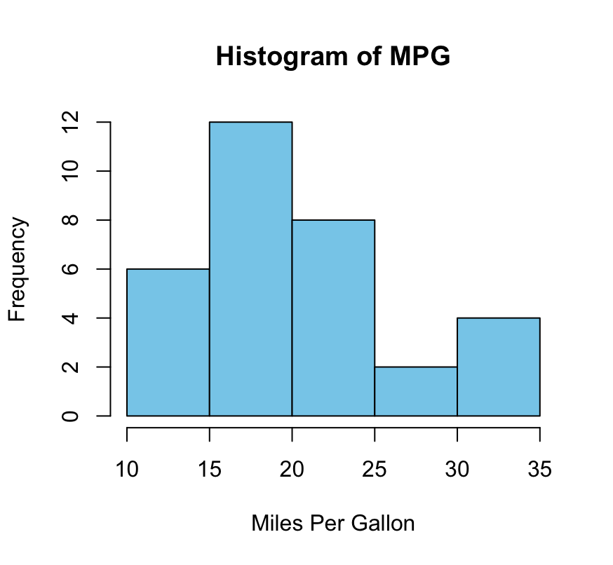
This simple code creates a histogram for the 'mpg' (miles per gallon) variable using the built-in 'mtcars' dataset to show the distribution of fuel efficiency.
Bivariate Histograms
Sometimes it's useful to explore the relationship between two variables in a dataset. Bivariate histograms are an effective way to visualize the joint distribution of two continuous variables. The hist2d() function from the hexbin package and the geom_bin2d() layer in ggplot2 are popular methods for creating bivariate histograms.
First, make sure the hexbin library is installed and loaded in your R library.
install.packages("hexbin")

library(hexbin)
After we are done with this, we can then code the bivariate histogram.
Code:
hbin <- hexbin(mtcars$mpg, mtcars$hp)
plot(hbin, main = "Bivariate Histogram: MPG vs. Horsepower", xlab = "MPG", ylab = "Horsepower", colramp = function(n) heat.colors(n))

library(ggplot2)
ggplot(mtcars, aes(x = mpg, y = hp)) +
  geom_bin2d(binwidth = c(5, 50), color = "white", fill = "skyblue") +
  labs(title = "Bivariate Histogram: MPG vs. Horsepower", x = "MPG", y = "Horsepower")
Plot:
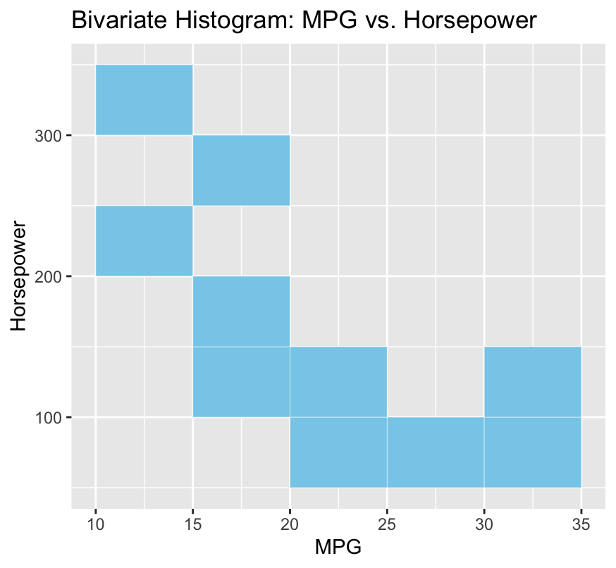
These examples show how to create bivariate histograms that reveal the joint distribution of fuel efficiency (MPG) and horsepower for the 'mtcars' dataset.
ggplot2 for Histograms
The R program includes some basic functions for creating simple histograms. The ggplot2 package is useful for its versatility and styling in data visualization. It uses styling and graphics, allowing users to create complex plots by layering them.
Let's look at how ggplot2 can be used to create any basic histograms.
Code:
ggplot(mtcars, aes(x = mpg)) +
  geom_histogram(binwidth = 4, fill = "skyblue", color = "black", alpha = 0.7) +
  labs(title = "Histogram of MPG with ggplot2", x = "Miles Per Gallon", y = "Frequency")
Plot:
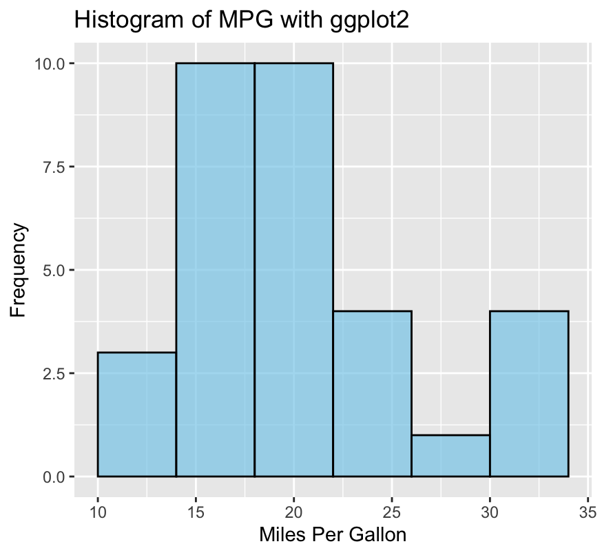
In this example, we use the ggplot2 library to generate a histogram of the 'mpg' variable, adjusting the binwidth, fill color, and other styling features to improve the visual appeal of our histogram.
Customizing ggplot2 Histograms
One of ggplot2's strengths is its customizability. It is known for creating highly customized plots and we can use those features to implement styling of our choice in our histograms. You can customize the histogram's colors, axis labels, and titles to meet your specific requirements.
Code:
ggplot(mtcars, aes(x = mpg)) +
  geom_histogram(binwidth = 4, fill = "skyblue", color = "black", alpha = 0.7) +
  labs(title = "Customized Histogram of MPG with ggplot2", x = "Miles Per Gallon", y = "Frequency") +
  theme_minimal() +
  theme(plot.title = element_text(hjust = 0.5, size = 16),
        axis.title = element_text(size = 12),
        axis.text = element_text(size = 10),
        axis.text.x = element_text(angle = 45, hjust = 1))
Plot:
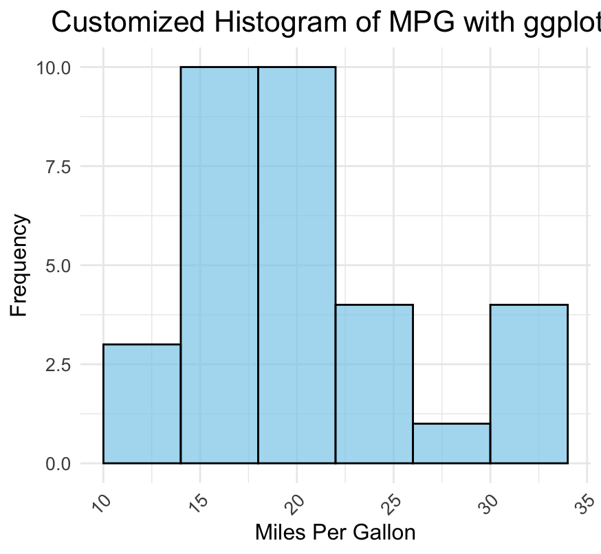
This example showcases a customized histogram with a minimal theme, adjusted title positioning, and rotated x-axis labels for better readability.
Two-Variable Histograms with ggplot2
To continue our investigation, let's use ggplot2 to generate a histogram with two variables. In this scenario, we'll look at the joint distribution of'mpg' and 'hp' variables from the'mtcars' dataset.
Code:
ggplot(mtcars, aes(x = mpg, y = hp)) +
  geom_bin2d(binwidth = c(5, 50), color = "white", fill = "skyblue") +
  labs(title = "Two-Variable Histogram: MPG vs. Horsepower", x = "MPG", y = "Horsepower")
Plot:
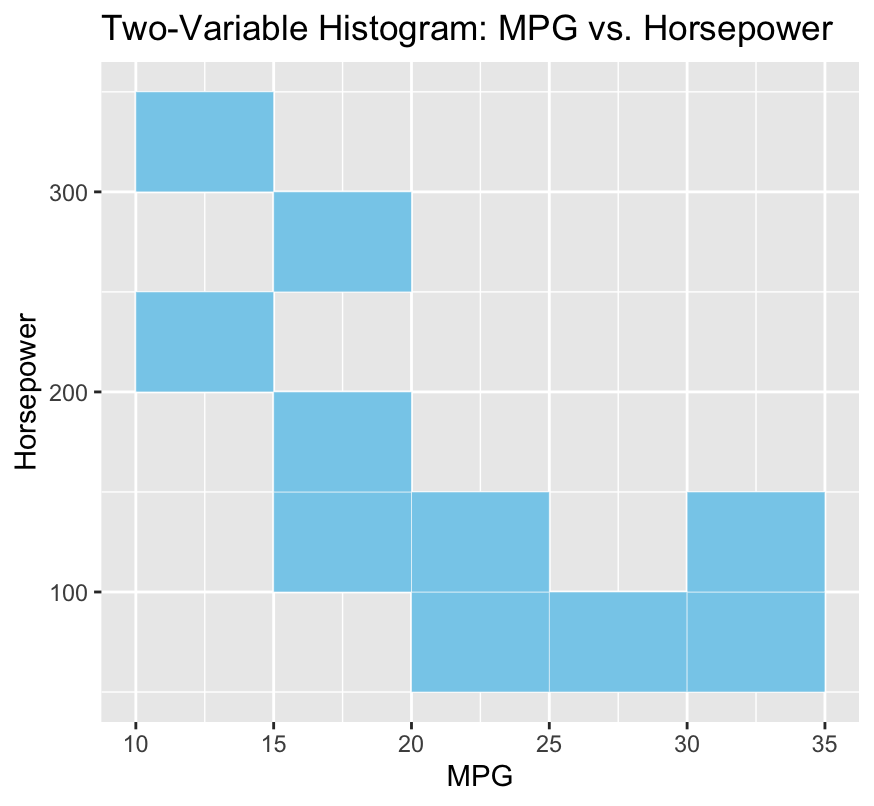
This ggplot2 code generates a heatmap-like representation, providing insights into the combined distribution of miles per gallon and horsepower.
Grouped Histograms with ggplot2
Grouped histograms are especially useful for comparing the distributions of various groups within a dataset. This could include comparing the distribution of a variable across various categories or groups. We can accomplish this with ggplot2 by using facets or dodged bar plots. Let's look into both approaches.
Faceted Grouped Histogram
Code:
ggplot(mtcars, aes(x = mpg, fill = as.factor(cyl))) +
  geom_histogram(binwidth = 2, position = "identity", alpha = 0.7) +
  facet_wrap(~cyl, scales = "free_y") +
  labs(title = "Faceted Grouped Histogram: MPG by Cylinder", x = "Miles Per Gallon", y = "Frequency", fill = "Cylinders")
Plot:
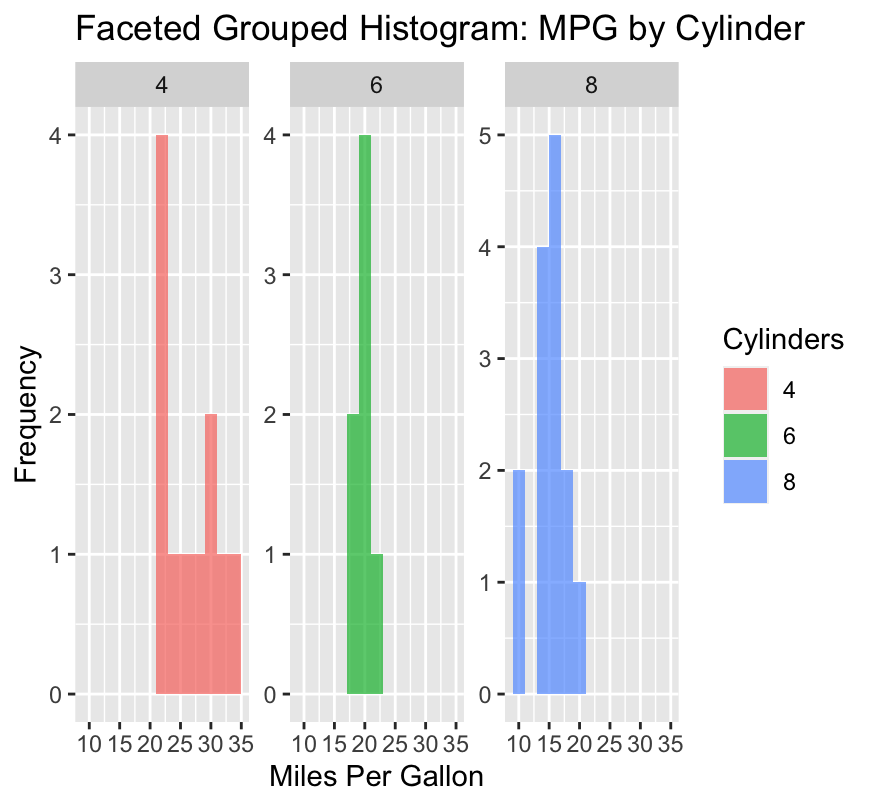
In this example, we use facets to create a grouped histogram, separating the distribution of 'mpg' for different cylinder categories in the 'mtcars' dataset.
Dodged Grouped Histogram
Code:
ggplot(mtcars, aes(x = as.factor(cyl), fill = as.factor(vs))) +
  geom_bar(position = "dodge", alpha = 0.7, stat = "count") +  # Use geom_bar and set stat="count"
  labs(title = "Dodged Grouped Bar Plot: Cylinder vs. V/S", x = "Cylinders", y = "Frequency", fill = "V/S") +
  scale_fill_manual(values = c("0" = "skyblue", "1" = "orange"))
Plot:
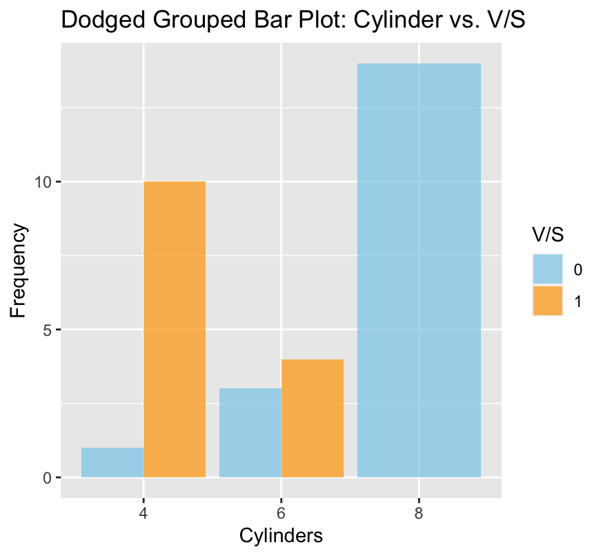
In this instance, we opt for a dodged histogram to compare the distribution of 'vs' (V/S, a binary variable) across different cylinder categories.
Conclusion
In this article, we examined the fundamentals of building histograms in R, looked at how to generate histograms with two variables, and investigated grouped histograms with ggplot2. Histograms in R, particularly when used with the ggplot2 tool, are an effective way to display and visualize the distribution of data. The ggplot2 provides a flexible toolkit for data analysts and researchers, allowing them to explore the relationship between two variables, customize visualizations, and compare group distributions.