
The correlation shows how two variables are related to each other. The correlation matrix is a powerful tool for exploring relationships between variables. In this article, we'll look at the concept of correlation matrices, how to create them with the R programming language, and what insights they provide.
What is a Correlation Matrix?
A correlation matrix is a table that shows the correlation between different variables. Each of the cells in the table represents the correlation between two unique variables. Their correlation scores, which exist between -1 and 1, show us the magnitude and direction of their linear relationship. A positive correlation means that there's a direct relationship between the variables, a positive correlation has a score nearing 1. A negative correlation, on the other hand, means that there exists an inverse relationship between the two variables, and it has a score nearing 1. A correlation near zero indicates a weak or no linear relationship.
Now, let's look at how to create and interpret a correlation matrix in the R programming language.
Creating a Correlation Matrix in R
R provides several functions to compute correlation matrices. The cor() function is the most commonly used.
Let's start with a simple example using random data.
Code:
set.seed(123)
data <- data.frame(
  A = rnorm(100),
  B = rnorm(100),
  C = rnorm(100),
  D = rnorm(100)
)

cor_matrix <- cor(data)

print(cor_matrix)
Output:
            A           B           C           D
A  1.00000000 -0.04953215 -0.12917601 -0.04407900
B -0.04953215  1.00000000  0.03057903  0.04383271
C -0.12917601  0.03057903  1.00000000 -0.04486571
D -0.04407900  0.04383271 -0.04486571  1.00000000
For this example, we create a dataset with four different variables - A, B, C, and D, and generate a correlation matrix using the cor() function. The output matrix gave us insight into how the different variables are correlated to each other, in a pairwise relation.
Interpreting a Correlation Matrix
Now that we have our correlation matrix, we must understand how to interpret it correctly. Let us break down the key elements of the correlation matrix.
1. Diagonal Elements
The diagonal elements show the correlation of the values with themselves. They have a perfect positive correlation of 1. If you ever see a different value on the diagonal, it might be a sign of an error or an issue in your dataset.
2. Symmetry
Correlation matrices are always symmetric, which means that the correlation between A and B is always equal to the correlation between B and A. This symmetry is a fundamental property of correlation matrices.
3. Coefficients
All the values apart from the diagonal elements are the coefficients between different pairs of variables. The values range from -1 to 1.
- A value close to 1 indicates a strong positive correlation.
- A value close to -1 indicates a strong negative correlation.
- A value near 0 suggests a weak or no linear relationship.
Visualizing Correlation Matrix
Numerical matrices are informative, but when it comes to finding trends and patterns, visualization proves to be the most effective. Visualization can help us enhance our understanding of the dataset and help identify patterns between the different variables. In larger datasets, this visualization proves to be the most important factor in decoding the message hidden in the dataset about the different relationships among them.
R environment provides us with various options to visualize our correlation matrix, but the corrplot package is the most widely used for this purpose. Let us look at an example to visualize the correlation matrix that we just made in the above-mentioned code example.
Code:
install.packages("corrplot")
library(corrplot)

corrplot(cor_matrix, method = "color")
Graph:
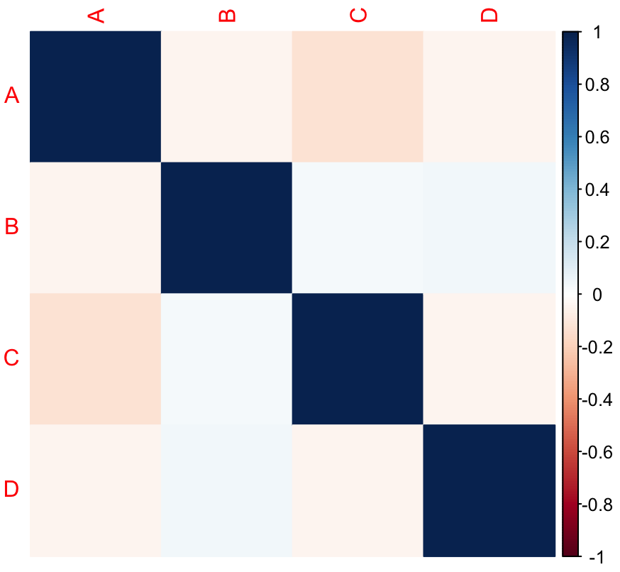
This code uses the corrplot package to create a color-coded correlation plot. The colors help identify the strength and direction of correlations quickly.
Real-World Examples
To understand the workings of correlation matrices, let's explore a real-world example involving financial data. We'll use the quantmod packages to retrieve stock prices, and then use the corrplot library to plot it.
Code:
library(quantmod)
library(corrplot)

stocks <- c("AAPL", "GOOGL", "MSFT", "AMZN")

getSymbols(stocks, from = "2020-01-01", to = Sys.Date(), adjust = TRUE)

prices <- list(AMZN.Close = AMZN$AMZN.Close,
               MSFT.Close = MSFT$MSFT.Close,
               AAPL.Close = AAPL$AAPL.Close,
               GOOGL.Close = GOOGL$GOOGL.Close)

prices_df <- do.call(merge, prices)

cor_matrix_stocks <- cor(prices_df)

corrplot(cor_matrix_stocks, method = "color")
Plot:
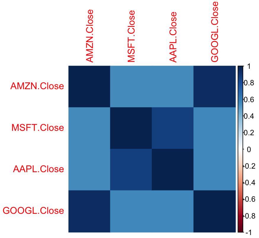
In this example, we use the quantmod package to obtain historical stock prices for Apple (AAPL), Google (GOOGL), Microsoft (MSFT), and Amazon (AMZN). We extract the closing prices of each stock and then join them in a single data frame named prices_df. The data frame is then used to calculate the correlation among the different closing prices using the cor() function. The resulting matrix sheds light on the relationship between these tech titans' stock price movements.
Conclusion
In conclusion, the correlation matrix in R is a necessary tool for both data analysts and statisticians, providing important insights into the complex relationships between variables in a dataset. The correlation matrix's ability to quantify and visualize correlations makes it useful in a variety of applications. It is used in a wide spectrum of environments, including but not limited to financial analysis, hypothesis testing, and feature selection in machine learning. However, correlation coefficients must be interpreted with caution, taking into account the data's context and potential outliers.