
Data visualization is both an art and a science, turning raw data into valuable insights. In the world of statistical programming, R stands out as a powerful tool for data visualization. Among its many functions, the abline function holds a special place, enabling users to effortlessly add lines to plots. This article will guide you comprehensively through the details of the abline function in R, with a specific emphasis on adding and customizing lines, especially regression lines.
Understanding the Basics
The "abline" function in R is a useful and essential tool that boosts the power of data visualization. It lets users easily add different types of lines to their plots, whether it's to highlight important concepts with simple lines or to explore complex relationships using regression lines, "abline" is a key function for improving how we understand and communicate information through visualizations. Before going into the details, let's take a look at the basic syntax of the abline function.
abline(a = NULL, b = NULL, h = NULL, v = NULL, ...)
Here,
a and b represent the intercept and slope of the line.
h and v denote the horizontal and vertical intercepts, respectively.
The ... argument allows for additional graphical parameters.
Now, let's start by adding a simple line to a scatter plot for a better understanding of how it works.
Adding a Simple Line to a Plot
Let's say we have a dataset with two variables, 'x' and 'y,' and we want to visualize their relationship. We can create some sample data and then add a line to the scatter plot. This line, drawn using the abline function, makes our plot even more informative and understandable.
Code:
set.seed(123)
x <- rnorm(100)
y <- 2 * x + rnorm(100)

plot(x, y, main = "Scatter Plot with abline", xlab = "X", ylab = "Y")

abline(a = 0, b = 1, col = "red", lty = 2)
Plot:
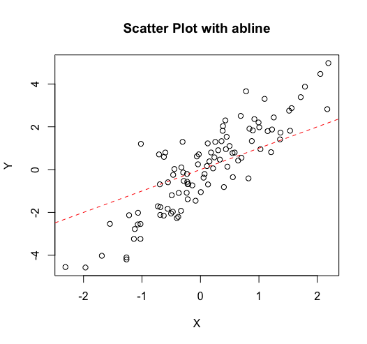
In this example, we generate random data exhibiting a linear relationship and employ the plot function to create a scatter plot. The abline function then overlays a red dashed line with an intercept of 0 and a slope of 1.
Plotting Regression Lines
The true power of abline emerges when visualizing regression lines. It helps us understand the relationship between two sets of information. Let's utilize a built-in dataset, such as 'mtcars' to demonstrate how to add regression lines to a plot. With this dataset, we can easily draw a plot and then add our regression line using the abline function. Let’s now look at the code.
Code:
data(mtcars)

plot(mtcars$wt, mtcars$mpg, main = "Scatter Plot with Regression Line",
     xlab = "Weight", ylab = "Miles per Gallon")

abline(lm(mpg ~ wt, data = mtcars), col = "blue")
Plot:
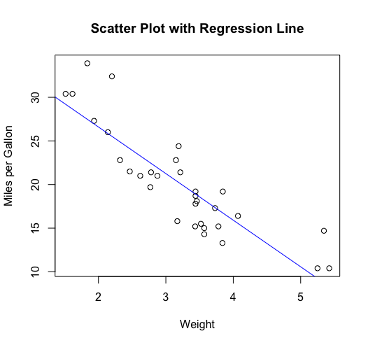
In this example, we use the lm function to fit a linear regression model to the 'mpg' variable against the 'wt' variable. The abline function then adds the regression line to the scatter plot, offering insights into the relationship between weight and miles per gallon.
Customizations in abline
The abline function is the creative toolkit for our plots, offering loads of ways to make the lines look just the way we want them. It's like picking different colors, styles, and shapes for our lines to make our plot visually more appealing. Let's explore some of these options.
Code:
# Create a scatter plot with customized abline
plot(x, y, main = "Customized abline", xlab = "X", ylab = "Y")

# Add a blue dashed line with intercept 0 and slope 1
abline(a = 0, b = 1, col = "blue", lty = 2)

# Add a red solid line with intercept 2 and slope 0.5
abline(a = 2, b = 0.5, col = "red", lty = 1)

# Add a green dotted line with horizontal intercept 1
abline(h = 1, col = "green", lty = 3)

# Add an orange dash-dot line with vertical intercept 2
abline(v = 2, col = "orange", lty = 4)
Plot:
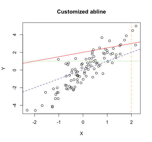
In this example, we generate a scatter plot and incorporate multiple lines with different colors, line types (lty), and intercepts. The abline function enables us to visualize various scenarios and hypotheses within the same plot.
Advanced Usage: Adding Multiple Lines with lapply
For scenarios where you need to add multiple lines to a plot, especially when visualizing different regression models, the lapply function can be very useful. It lets users easily add different types of lines to their plots, whether it's to highlight important concepts with simple lines or to explore complex relationships using regression lines. Let's consider an example with multiple regression lines.
Code:
set.seed(456)
x1 <- rnorm(50)
y1 <- 2 * x1 + rnorm(50)

x2 <- rnorm(50, mean = 3)
y2 <- 1.5 * x2 + rnorm(50)

x <- c(x1, x2)
y <- c(y1, y2)
group <- rep(c("Group1", "Group2"), each = 50)

plot(x, y, main = "Multiple Regression Lines", xlab = "X", ylab = "Y", col = c("blue", "red")[as.factor(group)])

lapply(unique(group), function(g) {
  subset_data <- subset(data.frame(x, y, group), group == g)
  abline(lm(y ~ x, data = subset_data), col = ifelse(g == "Group1", "blue", "red"))
})
Plot:
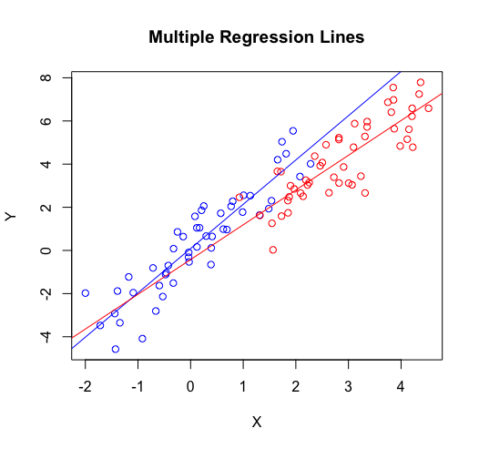
Here, we generate data with two groups, create a scatter plot with different colors for each group, and then use lapply to add regression lines for each group.
Conclusion
In summary, the abline function in R is a potent tool for elevating data visualization. Whether you're adding straightforward lines to convey concepts or overlaying regression lines to emphasize relationships, abline empowers users to communicate insights effectively. By mastering the syntax, grasping customization options, and exploring advanced usage, you can unleash the full potential of abline in your data visualization projects. The next time you venture into exploring and presenting data in R, keep in mind the prowess that abline adds to your plots, turning them from simple representations into compelling narratives.