

Infectious diseases such as H1N1, SARS, Zika, and most recently the COVID-19 virus continue to pose a global threat. Currently, the world is witnessing a coronavirus pandemic that has affected almost every country on the planet. In such events, it is pertinent to spread information faster than the diseases spread themselves. The advent of the information age has proven to be effective in the field of epidemic intelligence. In this post, we will perform four different methods of exploratory data analysis on a coronavirus dataset. Let us proceed step-by-step.
Importing the Libraries
The requests library (https://requests.readthedocs.io/en/master/) allows sending HTTP requests through Python, which will be used to obtain the dataset from the internet. Pandas (https://pandas.pydata.org/docs/) is an open-source Python library that provides powerful data structures and data analysis tools to deal with datasets. The most essential ingredient in the process of exploratory data analysis of a dataset is understanding the data through visualizations. The matplotlib.pyplot (https://matplotlib.org/) and seaborn (https://seaborn.pydata.org/) packages for Python are the most popular and used packages for data visualization through Python.
import requests
import pandas as pd
import matplotlib.pyplot as plt
import seaborn as sns
The Dataset
The code in this post will work on the dataset related to the coronavirus pandemic compiled by https://ourworldindata.org/coronavirus. Acknowledgments for this dataset must be given to Max Roser, Hannah Ritchie, Esteban Ortiz-Ospina, and Joe Hasell. The dataset can be downloaded directly from this GitHub repo: Github Data. However, since at this moment the coronavirus pandemic is continually evolving, it is better to use code to download this data so that the visualizations can be updated with the latest available data as and when necessary. You can download the dataset and save it with the filename variable given by the code below.
filename = 'covid-data.csv'
data_url = 'https://covid.ourworldindata.org/data/owid-covid-data.csv'
data_content = requests.get(data_url).content
csv_file = open(filename, 'wb')
csv_file.write(data_content)
csv_file.close()
Upon opening the file, you can notice that the dataset is huge as it contains values of various attributes for 210 different countries over a time period beginning from the 31st of December, 2019. We will load this data into a pandas DataFrame object, to make it easier to perform appropriate data extraction functions for our visualizations.
df = pd.read_csv(filename)
print(df.columns)
print(df.shape)
The column names indicate the various types of attributes that are present in the dataframe. The data has 19288 rows with 32 columns at the time of writing this post.
The Impact of the Covid-19 Virus
The coronavirus has spread to over 200 countries having a disastrous effect on human life all over the world. While almost every country is dealing with this pandemic, there is no doubt that some countries have been impacted more than others. Let us visualize the situation in the top ten countries with the most number of cases of Covid-19.
total_cases = df.groupby('location')['new_cases'].sum()
total_cases = total_cases.sort_values(ascending=False)

most_affected_countries = total_cases[1:11].index # Top 10 Most Affected Countries
First, the number of cases is summed for every ‘location’ using the groupby and sum functions on the dataframe. Then the result is sorted in descending order, giving the country name with the total number of cases in descending order. The countries with index 1 to 11, are the top ten countries with the most number of cases. The zero index refers to the worldwide count, which is ignored.
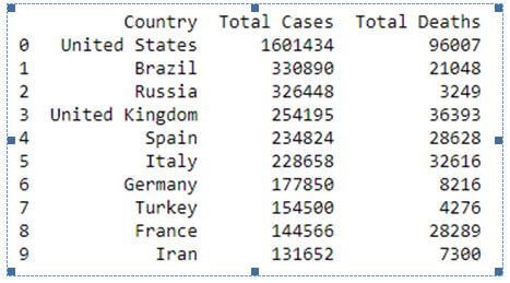
cases = total_cases[1:11].values # Number of Cases in Top 10 Countries

total_deaths = df.groupby('location')['new_deaths'].sum()
deaths = total_deaths[most_affected_countries].values # Number of Deaths in Top 10 Countries

cases_deaths_df = pd.DataFrame({'Country': most_affected_countries, 'Total Cases': cases, 'Total Deaths': deaths})
print(cases_deaths_df)
We use the same method to obtain the total number of deaths of each country and select the values of the top ten most affected countries. The collected data is added to a new dataframe object cases_deaths_df whose output is given below.
The above data is better visualized through a bar plot, where each country has one bar for the total number of cases and a second bar for the total number of deaths.
plot_data = pd.melt(cases_deaths_df, id_vars = ['Country'],  value_vars=['Total Cases', 'Total Deaths'],
                var_name='Metric', value_name='Case Count') # Plot Friendly Format
plt.figure(figsize=(12, 5))
sns.barplot(x="Country", hue="Metric", y="Case Count", data=plot_data)
plt.title('Most Affected Countries (Top 10)')
plt.show()
Before the data is plotted, it is converted into another form using the melt function where each country has two rows – one for total cases and the second for total deaths. This is now plotted using the barplot function of the seaborn library.
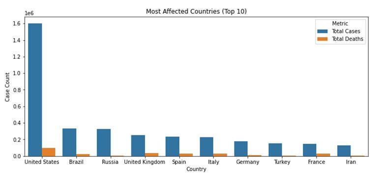
Through the above visualization, it is evident that the United States is by far the most affected country with over a million total cases. We can also see that while Russia has the third-highest number of cases, it has a lower death count than countries like the United Kingdom and Spain. Between France and Turkey, Turkey has a slightly more number of cases, but a lower death rate than France.
Countries Testing for Covid-19 the Most
The dataset contains a column – total_tests_per_thousand that can be an indicative measure of the number of tests done by a country. However, for the purposes of this post, the testing rate is defined as the count of the total tests done divided by the total population of the country. This testing rate is calculated for each country and sorted in a descending order, to get the top ten countries with the best testing rates.
total_tests = df.groupby('location')['new_tests'].sum().values
population = df.groupby('location')['population'].nth(-1)
testing_rate = (total_tests/population).sort_values(ascending = False)[:10]
The value of this testing rate can be visualized best using a bar plot, and hence the barplot method of the seaborn library is called again, however with the argument ‘h’ for orient. This indicates a horizontal bar plot instead of a vertical one as the one given above.
plt.figure(figsize=(10, 5))
sns.set_color_codes("pastel")
sns.barplot(y = testing_rate.index, x = testing_rate.values, orient = "h", color="b")
plt.title('Testing Rate (Top 10 Countries)')
plt.xlabel('Total Tests / Total Population')
plt.ylabel('Country')
plt.show()
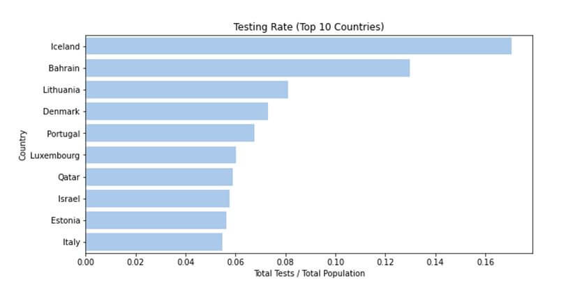
Hence, according to our definition of the testing rate, Iceland is the country testing the most with more than 0.16% of the population tested.
Comparing the Rate of Increase of the Coronavirus Disease
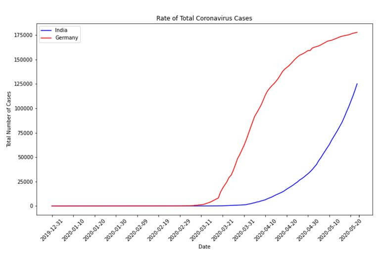
Let us now compare the rate of increase of coronavirus cases between the two countries. This will be a date series visualization with the dates in increasing order of time on the X-axis, and the number of cases on the Y-axis. While this post shows the result of a comparison between the data of India and Germany, any two countries can be compared as given in the dataset.
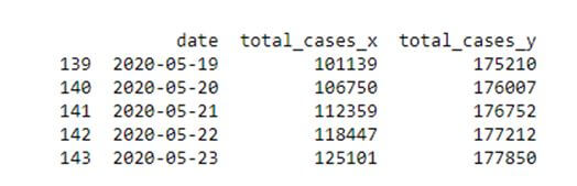
First, the date and total cases columns are extracted from each country’s data to form two separate dataframes. These two dataframes are then merged into a single dataframe using an ‘inner join’ operation on the date column. An inner join ensures that only those date values are included which are present in both dataframes being merged.
country1 = 'India'
country1_data = df.loc[df['location'] == country1]
country1_cases = country1_data[['date','total_cases']]

country2 = 'Germany'
country2_data = df.loc[df['location'] == country2]
country2_cases = country2_data[['date','total_cases']]

datewise_cases = country1_cases.merge(country2_cases, how = 'inner', on = 'date')
print(datewise_cases.tail())
This dataframe is now used to plot a line chart using the plot function of the matplotlib.pyplot library. The first country’s data is plotted using a blue coloured line while the second country’s data is plotted using a red coloured line.
plt.figure(figsize=(12, 7))
plt.plot(datewise_cases['date'].values, datewise_cases['total_cases_x'].values, color='blue', label=country1)
plt.plot(datewise_cases['date'].values, datewise_cases['total_cases_y'].values, color='red', label=country2)
plt.xticks([datewise_cases['date'][i] if i%10 == 0 else '' for i in range(len(datewise_cases.index))], rotation = 45)
plt.xlabel('Date')
plt.ylabel('Total Number of Cases')
plt.title('Rate of Total Coronavirus Cases')
plt.legend()
plt.show()
The xticks functions helps add the markings on the X-axis, the xlabel and ylabel functions add labels to the X-axis and Y-axis respectively and the legend function adds a legend for the graph which shows which colour indicates which country.
Degree of Correlation between Cases and Various Factors
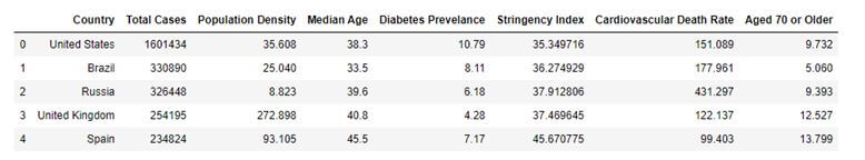
This dataset provided by the World in Data organization has many different attributes related to not only coronavirus but also a country’s health features. We can calculate the degree of correlation between such features and the total number of cases to see if there is any correlation effect. A degree of correlation indicates how a change in one variable affects another variable and can be positive or negative. Let us see if the features – population density, median age, diabetes prevalence, stringency index, cardiovascular death rates and population aged 70 or older; of a country have any correlation to the total number of cases in the country. This correlation calculation is performed on the top ten most affected countries only.
The features for the respective countries are extracted using the groupby function and nth or mean functions. The nth function returns the nth value of the group, -1 indicating the last value. This data is compiled into the df_corr dataframe as given below.
df_corr = pd.DataFrame(most_affected_countries.values, columns = ['Country'])
df_corr['Total Cases'] = cases

pop_density = df.groupby('location')['population_density'].nth(-1)
df_corr['Population Density'] = pop_density[most_affected_countries].values

median_age = df.groupby('location')['median_age'].nth(-1)
df_corr['Median Age'] = median_age[most_affected_countries].values

diabetes_prevalence = df.groupby('location')['diabetes_prevalence'].nth(-1)
df_corr['Diabetes Prevelance'] = diabetes_prevalence[most_affected_countries].values

stringency_index = df.groupby('location')['stringency_index'].mean()
df_corr['Stringency Index'] = stringency_index[most_affected_countries].values

cvd_death_rate = df.groupby('location')['cvd_death_rate'].nth(-1)
df_corr['Cardiovascular Death Rate'] = cvd_death_rate[most_affected_countries].values

aged_70_older = df.groupby('location')['aged_70_older'].nth(-1)
df_corr['Aged 70 or older'] = aged_70_older[most_affected_countries].values

print(df_corr.head())
The correlations between the variables are computed using the corr function which is a pandas DataFrame function to calculate correlation values in the dataframe. The best way to visualize correlation values is a heat map which is plotted using the heatmap function of the seaborn library.
heatmap_df = pd.DataFrame({'Correlation Values': df_corr.corr()['Total Cases'].values}, index = df_corr.corr()['Total Cases'].index)
sns.heatmap(heatmap_df, annot=True)
plt.show()
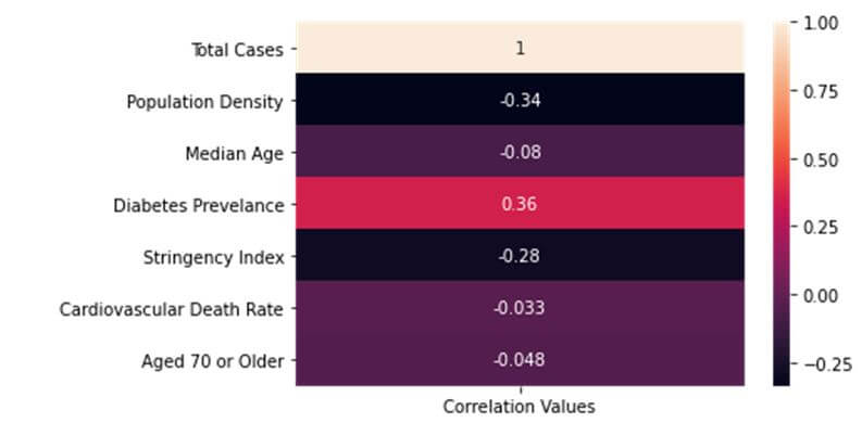
Hence, we see that most attributes have negative correlations with the total number of cases while one attribute has a positive correlation. The total number of cases obviously has a direct correlation value of 1 with itself. However, none of the correlation values are high correlation values which are usually greater than 0.6 or lesser than -0.6. Perhaps, this goes to show how devastatingly widespread the effects of this contagious disease is.
As the world continues to become more data-centric, understanding a pandemic in terms of data can be a pivotal advantage for containing it. Please note that all the graphs presented in this post are updated until 23 May 2020. You can always run the code yourself with the updated data and perform your analysis and/or predictions on the evolution of this pandemic and its effect on countries worldwide. In case you are stuck somewhere or need further clarification on a concept, FavTutor is always here to provide you with help from expert tutors 24/7. Get started by sending a message through the chat on the bottom right. Happy programming!