Best Coding Fonts for Developers in 2026
Not a list of screenshots. Every free font on this page is embedded and rendering right now, every measurement was read out of the actual font file, and every price was checked on the vendor’s own checkout page this week.

Short answer: for most developers in 2026 the best coding font is JetBrains Mono. It is free, it reads well at small sizes, and nothing about it is strange. If you use a small screen, pick Iosevka instead, because it fits about 20% more code on each line. If text feels too small or your eyes get tired, pick Atkinson Hyperlegible Mono and raise your font size. The rest of this page shows you why, with every font rendering live so you can judge for yourself.
You will look at your coding font for more hours this year than you look at most people's faces. It is worth twenty minutes of thought. This page gives you those twenty minutes.
There are a lot of "best coding font" lists. Most are the same nine fonts with a stock screenshot and one sentence each. This one is different in four ways:
- Every free font here is live, not a picture. Change the code sample, the size, the line height, the theme and the ligature setting. You are looking at the real font file.
- We measured the fonts ourselves. Every x-height and cell width in the comparison table was read out of the actual font file with fontTools on 25 July 2026. None of it was copied from a marketing page.
- We checked what is still maintained. Several of the most recommended fonts in the world have not shipped an update in years. That is in the table, because it should change what you pick.
- We looked up the evidence, including where there is none. No study has ever tested whether coding ligatures help or hurt. No study has ever compared coding fonts for reading code. We say so, and we explain what research does exist.
Two quick disclosures. Paid fonts cannot legally be embedded in a web page, so for those we show a close free stand-in and label it clearly. And prices were read off each vendor's own checkout page on 25 July 2026. Fonts get repriced, so click through before you buy.
Best Coding Font by Use Case
If you only have a minute, take the one that matches your situation and go. Everything below is the working out.
Free, sensible, in every JetBrains IDE, tall lowercase so it reads big. Nobody has ever regretted it.
Its character cell is 0.5 em against everyone else's 0.6. That is roughly 20 percent more code per line.
Drawn by the Braille Institute with a published list of exactly which letter pairs it separates. Then raise your font size before anything else.
Hundreds of smart ligatures, three separate ways to turn them off, and perfect 2:1 CJK alignment if you need it.
Geist Mono if you already use Geist Sans. Lilex if you use IBM Plex. Both are variable, free and actively maintained.
12,337 glyphs. Everything else renders your sigmas and nablas as empty boxes.
Not the answer you expected. It is the cheapest paid font here, and it has the strongest unpaid accessibility testimonials of anything we found.
Five metrics-compatible families you can mix in one file, plus texture healing, which is the cleverest idea in the field.
Try All 41 Fonts Live
This is the part every other article is missing. Pick a font, set it to the size you actually use, choose the language you actually write, and look at it. The numbers underneath update as you go, including how many columns that font would give you in a 920 pixel pane, which is the density argument made concrete.
Tip: set the size to what you actually use, then flip through the font list. Differences that look huge in a specimen often vanish at 14px, and differences you never noticed suddenly matter.
Compare Two Coding Fonts Side by Side
Two fonts, identical code, identical size. This is the fastest way to feel the difference between a 0.5 em cell and a 0.6 em cell.
Both panes use the same size and the same code. Watch the right edge: that is where cell width shows up.
The Character Disambiguation Test
This is the test that actually matters, and it is the one almost no roundup shows you. Zero against capital O.
One against lowercase L against capital i against the pipe. Five against S. Eight against B. The letter pair
rn against m, which is a documented phishing technique, not a theoretical worry.
Switch fonts and watch which pairs collapse. Then tick the box to shrink everything to 13px, because that is where
you actually read it.
Why Font Size in Pixels Tells You Nothing
Every row below is set at the same pixel size. The apparent size differences come entirely from x-height, which across these fonts ranges from 0.455 to 0.618 of the em. That is a 35 percent spread, and it is the hidden variable behind most claims that one font is clearer than another.
Every line above is set at exactly the same pixel size. That is the whole point: "this font is bigger" is usually "this font has a taller x-height". Every figure here was measured twice, once from the font’s OS/2 table and once from the drawn outline of the letter x, and the two agree.
How to Choose a Coding Font
Before the reviews, here is the framework. Nearly every argument about coding fonts is really an argument about one of these seven things. Once you can name them, you can stop having the argument.
1. X-Height, Not Point Size
The x-height is how tall the small letters are, measured against the font's design square. Across the fonts on this page it runs from 0.455 to 0.618. That is a 35% spread. Two fonts set to exactly 14px can look a third different in size.
This one fact explains most claims that "font X is more readable". Vision research backs it up. Across 1,049 typefaces, Legge and Bigelow found x-heights ranging from 0.28 to 0.58 of the em, and concluded that point size is a poor guide to how big text actually looks. So when someone says JetBrains Mono is clearer than Source Code Pro, part of what they are noticing is that it is 13% taller at the same setting.
2. Cell Width, and How Much Code Fits
In a monospaced font, every character gets the same width. That number, divided by the design square, is the whole density story. Inconsolata and Iosevka sit at 0.50. Most fonts sit at 0.60. Martian Mono sits at 0.70.
Going from 0.60 to 0.50 gives you about 20% more characters per line at the same size. If you run two files side by side on a laptop, that is the difference between a line wrapping and not wrapping. It is the most underrated number in font choice.
3. Telling 0, O, 1, l and I Apart
A code font has one job a normal font does not. It has to make sure 0 and O, 1 and l and I, 5 and S, rn and m can never be mistaken for each other. When you read a sentence, context saves you. When you read a hex string, a password, a commit hash or a variable name, nothing does.
This is not a matter of taste, and the evidence comes from outside software. NASA's 1992 report on cockpit documents found the same confusable groups and set minimum letter sizes to avoid them. Crockford's Base32 format simply deletes I, l, O and U from its alphabet, because "I and l can be confused with the number 1, O can be confused with 0". Unicode has a whole security standard, UTS 39, about characters that look alike, because attackers use them. A font that keeps rn and m apart is doing security work, not decoration.
4. Font Rendering on Windows, macOS and Linux
The same font file looks different on macOS, Windows and Linux. This is the most common reason people think a font is "too thin".
Apple removed subpixel antialiasing in macOS Mojave in 2018, so macOS now smooths text in grey only. Windows uses ClearType, which uses the red, green and blue parts of each pixel separately and effectively triples the horizontal detail, so text looks sharper and thinner. Linux uses FreeType, which is adjustable to a fault.
What to do: on a Mac, go up a size or pick a Medium weight. On Windows, prefer a font with real hand-written hinting (Intel One Mono is one of the few). On Linux, turn on stem darkening before you decide a font is too light.
5. Ligature Policy, and Whether You Can Turn It Off
The question is not "ligatures, yes or no". It is how much control the font gives you. Fira Code and Cascadia Code put ligatures in the calt feature, which most software turns on by default. Monaspace, Intel One Mono and Geist Mono hide them in stylistic sets, off until you ask. 0xProto has ligatures but refuses to change the shape of a character. Maple Mono lets you bake your choices into the font file itself.
One trap to know about. Several fonts have no liga feature at all. So an editor setting that only switches off liga will look like it is doing nothing. You have to switch off calt.
6. Character Coverage for Symbols and Other Languages
This bites you in the terminal, not the editor. No box-drawing characters means tmux borders and htop fall apart. No Powerline glyphs means your prompt shows empty boxes. And if you write Chinese or Japanese in comments, you need a font where those characters are exactly twice the width of the Latin ones, or your Markdown tables will never line up.
The range is huge. Comic Mono has 106 glyphs. JuliaMono has 12,337.
7. Licence and Maintenance
Most free coding fonts use the SIL Open Font License 1.1. You can use, change and share them, as long as you rename anything you modify. But not all of them. Hack uses a three-part licence stack that includes Bitstream Vera. Ubuntu Sans Mono uses the Ubuntu Font Licence. DejaVu is partly public domain. If your company reviews licences, check first.
Maintenance matters more than people think. Fira Code has not shipped since 2021. JetBrains Mono has not shipped since 2023. Cascadia Code has not shipped since 2024. Those fonts still work fine. But if you hit a bug, nobody is coming.
Coding Font Comparison Table
Sortable. The x-height and cell width columns are the two numbers that predict most of your experience, and they were measured directly from the font binaries rather than taken from any vendor's claims.
| Font | Sample | x-height | Cell width | Ligatures | Latest release | Maintenance | Price | Licence |
|---|---|---|---|---|---|---|---|---|
| JetBrains Mono | 0O1lI {}=> | 0.55 | 0.6 | Yes | 2.304 (Jan 2023) | Stagnant | Free | SIL OFL 1.1 |
| Fira Code | 0O1lI {}=> | 0.526 | 0.6 | Yes | 6.2 (Dec 2021) | Repo alive, releases frozen | Free | SIL OFL 1.1 |
| Cascadia Code | 0O1lI {}=> | 0.518 | 0.5859 | Yes | 2407.24 (Nov 2024) | Dormant | Free | SIL OFL 1.1 |
| IBM Plex Mono | 0O1lI {}=> | 0.516 | 0.6 | No | 2.5.0 (June 2026) | Most actively maintained classic | Free | SIL OFL 1.1 |
| Source Code Pro | 0O1lI {}=> | 0.486 | 0.6 | No | 2.042 (Apr 2023) | Stable, no changes in 3 years | Free | SIL OFL 1.1 |
| Hack | 0O1lI {}=> | 0.547 | 0.6021 | No | 3.003 (Mar 2018) | Dormant for 8 years | Free | MIT + Bitstream Vera + public domain (not OFL) |
| Iosevka | 0O1lI {}=> | 0.52 | 0.5 | Yes | 34.7.0 (June 2026) | Extremely active, 12 releases in 2026 | Free | SIL OFL 1.1 |
| GitHub Monaspace | 0O1lI {}=> | 0.513 | 0.62 | Yes | 1.400 (Mar 2026) | Active | Free | SIL OFL 1.1 |
| Maple Mono | 0O1lI {}=> | 0.55 | 0.6 | Yes | 7.9 (Dec 2025) | Very active | Free | SIL OFL 1.1 |
| Commit Mono | 0O1lI {}=> | 0.54 | 0.6 | Yes | 1.143 (Dec 2023) | Dormant since 2023 | Free | SIL OFL 1.1 (font) + MIT (site) |
| 0xProto | 0O1lI {}=> | 0.55 | 0.62 | Yes | 2.502 (Jan 2026) | Active but slow | Free | SIL OFL 1.1 |
| Geist Mono | 0O1lI {}=> | 0.53 | 0.6 | No | 1.8.0 (Mar 2026) | Active | Free | SIL OFL 1.1 |
| Lilex | 0O1lI {}=> | 0.516 | 0.6 | Yes | 2.700 (Apr 2026) | Active | Free | SIL OFL 1.1 |
| Intel One Mono | 0O1lI {}=> | 0.465 | 0.614 | Yes | 1.4.0 (Jul 2024) | Dormant | Free | SIL OFL 1.1 |
| Atkinson Hyperlegible Mono | 0O1lI {}=> | 0.496 | 0.632 | No | 2.001 (Nov 2024, still first release) | First release | Free | SIL OFL 1.1 |
| Victor Mono | 0O1lI {}=> | 0.618 | 0.6 | Yes | 1.5.6 (Jan 2024) | Font dormant, site maintained | Free | SIL OFL 1.1 |
| Recursive Mono | 0O1lI {}=> | 0.54 | 0.6 | Yes | 1.085 (Jun 2022) | Effectively unmaintained | Free | SIL OFL 1.1 |
| JuliaMono | 0O1lI {}=> | 0.55 | 0.6 | Yes | 0.63.2 (Jul 2026) | Very active | Free | SIL OFL 1.1 |
| Google Sans Code | 0O1lI {}=> | 0.523 | 0.6 | No | 7.001 | Active | Free | SIL OFL 1.1 |
| Adwaita Mono | 0O1lI {}=> | 0.52 | 0.6 | No | Shipping with GNOME | Active | Free | SIL OFL 1.1 |
| Departure Mono | 0O1lI {}=> | 0.545 | 0.6364 | No | 1.500 (May 2025) | Quiet | Free | SIL OFL 1.1 |
| Comic Mono | 0O1lI {}=> | 0.485 | 0.5449 | No | 0.1.1 (file frozen since 2019) | Abandoned | Free | MIT |
| Sudo | 0O1lI {}=> | 0.538 | 0.5385 | Yes | 3.6 (May 2026) | Very active | Free | SIL OFL 1.1 |
| iA Writer Mono | 0O1lI {}=> | 0.516 | 0.6 | No | 2.000 | Stable | Free | SIL OFL 1.1 |
| Inconsolata | 0O1lI {}=> | 0.457 | 0.5 | No | 3.000 (Dec 2019) | No human font work since 2022 | Free | SIL OFL 1.1 |
| Martian Mono | 0O1lI {}=> | 0.6 | 0.7 | Yes | 1.1.0 (Feb 2025) | Slow | Free | SIL OFL 1.1 |
| DejaVu Sans Mono | 0O1lI {}=> | 0.547 | 0.6021 | Yes | 2.37 (Jul 2016) | Dormant for a decade | Free | Bitstream Vera + Arev + public domain (not OFL) |
| Roboto Mono | 0O1lI {}=> | 0.528 | 0.6001 | No | 3.001 (Apr 2025) | Modernised in 2025 | Free | SIL OFL 1.1 (relicensed from Apache 2.0 on 31 March 2025) |
| Ubuntu Sans Mono | 0O1lI {}=> | 0.518 | 0.56 | No | 1.100 (May 2026) | Active but slow | Free | Ubuntu Font Licence 1.0 (not OFL) |
| Noto Sans Mono | 0O1lI {}=> | 0.536 | 0.6 | No | 2.014 (Sep 2023) | Family stale, project active | Free | SIL OFL 1.1 |
| Space Mono | 0O1lI {}=> | 0.496 | 0.612 | No | 1.003 (Jan 2025) | Repository archived | Free | SIL OFL 1.1 |
| Anonymous Pro | 0O1lI {}=> | 0.455 | 0.5459 | No | 1.002 | Dormant ~15 years | Free | SIL OFL |
| Fragment Mono | 0O1lI {}=> | 0.524 | 0.618 | Yes | 1.21 (Jun 2024) | Quiet | Free | SIL OFL 1.1 |
| MonoLisa * | 0O1lI {}=> | 0.55 | 0.6 | Yes | 3.000 (June 2026) | Active | $149 Developer, $199 Code + Text, Creator from €49 per weight | Commercial EULA |
| Berkeley Mono (TX-02) * | 0O1lI {}=> | 0.52 | 0.5 | Yes | 2.004 (Nov 2025) | Active | $75 base, $215 fully specified, commercial from $225 | Commercial, per-module |
| Comic Code * | 0O1lI {}=> | 0.485 | 0.5449 | No | Current build May 2022 | Stable | $30 for the 12-font Coding Essentials pack | Commercial, per seat |
| Operator Mono * | 0O1lI {}=> | 0.618 | 0.6 | Yes | Stable | Stable | $199 for 10 styles on one computer, $248 for two | Commercial, per computer |
| PragmataPro * | 0O1lI {}=> | 0.52 | 0.5 | Yes | 0.903, variable version added 2025 | Active | €19 Essential, €59 one weight, €199 all weights (1 to 5 employees) | Commercial, by company size |
| Input * | 0O1lI {}=> | 0.486 | 0.6 | No | Stable | Stable | Free for coding; $200 for the full 168-style series | Free for all software development, paid only to publish or embed |
| MD IO * | 0O1lI {}=> | 0.6 | 0.7 | Yes | 16 styles, 2021 to 2026 | Active | Not published. €50 per style is the only figure the foundry has ever stated; Fontstand rents the family at €48 a month | Commercial, by headcount, covers everything |
| Cartograph CF * | 0O1lI {}=> | 0.54 | 0.6 | Yes | Current | Stable | $323.99 for the 16-style family, $35.99 per style | Commercial, one device per user |
Click any column heading to sort. x-height and cell width are fractions of the em, measured from the exact font files embedded in this page on 25 July 2026. Rows marked * are paid fonts we cannot embed, so the sample column shows the free stand-in named in that font's review.
All 41 Coding Fonts Reviewed
Each review has a live specimen at the top: character disambiguation on the first line, a line of real code with the classic confusable characters in it, and a row of operator sequences so you can see exactly what the ligatures do, or that there are none.
The Essentials (Fonts 1–7)
If you have not thought about this before, your answer is almost certainly in this group. These are the fonts that turn up in every thread, and they turn up for good reasons.
1. JetBrains Mono
FreeThe safe default. If you have no opinion yet, start here and stop reading.
JetBrains built this for its own IDEs and then gave it away, which is the single most important thing that has happened to coding fonts in the last decade. It has the tallest lowercase letters of any mainstream code font, which we measured at 0.550 em. JetBrains says this means your eye travels less along each line. That claim is marketing rather than science. But the practical effect is real. At 13px, JetBrains Mono simply looks bigger than Source Code Pro at 13px, because its lowercase letters are about 13% taller.
The other thing it gets right is that nothing is weird. Every glyph is the obvious shape. There are no surprises to get used to it to, no cursive italics to argue about, no aggressive personality. That is why it wins the "what should I use" threads by default and why it is genuinely difficult to justify spending money after you have tried it.
The awkward part is maintenance. The last release was January 2023. The repository gets occasional housekeeping commits but no font work. Worse, the download button on jetbrains.com/lp/mono was still serving a 2021 build of version 1.0.3 when we checked in July 2026, several major versions behind the 2.304 on GitHub. Get it from GitHub Releases or Google Fonts, not from the marketing page.
Strengths
- Tallest x-height of the mainstream monos, so it reads large at small sizes
- 8 weights plus a variable build, plus a no-ligature 'NL' build in the same zip
- Ships inside every JetBrains IDE since 2019.3, so your team already has it
- 148 languages, first-party Nerd Font patch, on Google Fonts
Weaknesses
- No font release since January 2023
- The italic is mostly a 9 degree slant; only a, y and f are genuinely redrawn
- The official landing page serves an ancient version
- The 'NL' build has an empty feature table, so you also lose stylistic sets and the slashed zero
“JetBrains Mono does make it very hard to justify spending anything more than nothing on a good font.”
Hacker News, Show HN: Monolisa v3, June 2026
calt. There is no liga feature, so switching liga off does nothing.2. Fira Code
FreeThe most popular coding font on GitHub, and the reason your team argues about ligatures.
82,000 GitHub stars. No other coding font is close. Fira Code did not invent programming ligatures (Hasklig did, for Haskell) but it generalised the idea and made it the default expectation for a modern code font.
Here is the strange part. The most popular coding font in the world has not shipped a release since 6 December 2021. The repository is still being committed to, and the changelog already carries an unreleased "7.0" heading with a single entry in it. So it is maintained in the sense that someone is there, and unmaintained in the sense that nothing ships.
Two practical quirks. First, there is no italic at all, so your editor synthesises a fake slant for comments, which looks poor at small sizes. Second, and this catches people out: Fira Code's zero is slashed by default, and turning on the zero feature switches it to dotted. Every other font in this article works the other way round.
Strengths
- The most battle-tested ligature set in existence
- Widest character cell of the ligature fonts, so code feels roomy
- Includes progress-bar glyphs and a strong box-drawing set for terminals
- Universally available: Google Fonts, Homebrew, every package manager
Weaknesses
- No italic, at all
- No release in four and a half years
- Slashed zero by default with an inverted 'zero' feature, which surprises people
- The release zip ships without a licence file
“I've been using Fira Code for the last six months and I really like the ligatures. I know they're not for everyone, but they work for me. And the best thing about it is that no one else is forced to deal with them.”
r/programming, 292 upvotes
calt.3. Cascadia Code
FreeMicrosoft's terminal font, and the only mainstream free font with a proper cursive italic.
Cascadia was drawn for Windows Terminal and it shows: it has the narrowest cell of the big four ligature fonts (0.586 em against JetBrains Mono's 0.600), which buys you a few extra columns in a split pane. Windows Terminal defaults to Cascadia Mono, the ligature-free sibling, which is a sensible choice for a terminal and one most people never notice.
The italic is the reason to care. In 2021 Microsoft added a genuinely redrawn italic ("Curve"), and then a second, more calligraphic cursive design behind ss01. That gives you the Operator Mono look for free, which no other mainstream free font offers with this much polish.
Microsoft ships four flavours in the box: Code (ligatures), Mono (no ligatures), PL (Powerline) and NF (Nerd Font). That is unusually thoughtful packaging. It is also the largest download here at about 150MB, and there has been no release since November 2024.
Strengths
- Real cursive italic, plus a second italic design behind ss01
- Ships Code / Mono / Powerline / Nerd Font variants first-party
- Widest script coverage of the free defaults: Arabic, Hebrew, Cyrillic, Greek, Vietnamese
- Narrow cell, which is a real advantage in split panes
Weaknesses
- No release since November 2024
- 150MB download, and the README warns you to uninstall older versions first
- Lowest x-height of the four big ligature fonts, so it reads small
- The Google Fonts copy is the ligature 'Code' cut only; Mono, Powerline and Nerd Font builds need the GitHub download
“Very interesting and super innovative. That said, no slashed zero, no dice for me.”
YouTube, Syntax, on a rival font: the slashed zero is a hard requirement for many developers
calt. Microsoft credits Fira Code for the OpenType code.4. IBM Plex Mono
FreeThe one that reads like a proper text typeface, not a terminal font.
Plex Mono is the odd one out in a good way. It was drawn by a real type foundry as part of a corporate identity system, not as a developer tool, and it carries itself accordingly. Letterforms are warm, the italic is a true italic at 9 degrees with a single-storey a and a descending f, and the whole thing looks better in a README or a slide than most code fonts do.
It is also, quietly, the best-maintained font in this entire article. Version 2.5.0 shipped on 11 June 2026 and added an alternate l, comma and quote alternates, and the ASCII control pictures at U+2400. While Fira Code, JetBrains Mono and Cascadia sat still, IBM kept shipping.
If you want ligatures with this exact look, use Lilex, which is Plex Mono plus ligatures plus Powerline glyphs plus a variable weight axis. Zed ships Lilex as its default for precisely this reason.
Strengths
- Genuinely beautiful true italic, redrawn rather than slanted
- The only classic here with a 2026 release
- 8 weights including a 'Text' weight tuned for body copy
- Excellent for documentation, slides and screenshots as well as code
Weaknesses
- No ligatures at all, and no variable font for the mono cut
- Smallest character set of the classic free fonts
- No Greek in the Google Fonts subsets
- Low x-height, so it needs a point size bump
“I honestly thought I would never switch from IBM Plex.”
YouTube comment, A Better Computer
liga, calt, dlig or clig feature at all.5. Source Code Pro
FreeThe airy, low-density classic. Great in an editor, feels thin in a terminal.
Adobe adapted this from Source Sans and refitted it to a uniform width, and the result is the lightest-textured font in the article. Where JetBrains Mono and Hack pack ink into the line, Source Code Pro leaves air around everything. Some people find that restful; others find it washed out on a Mac, where there has been no subpixel antialiasing since 2018.
Its lowercase letters are the smallest of any font here that people actually ship with. We measured 0.486 em in the copy embedded on this page. At the same setting it reads noticeably smaller than JetBrains Mono. Turn it up two points and it becomes a different, much better font.
One genuinely nice detail: it has three separate slashed-zero alternates reachable through zero, cv12 or salt, the most configurable zero of any free font here.
Strengths
- Calm, low-density texture that many people find less fatiguing
- Three slashed-zero variants to choose from
- True italic at 11 degrees with a redrawn cursive a and g
- Variable font in both upright and italic
Weaknesses
- Smallest usable x-height here, so it needs a size bump
- No ligatures whatsoever
- Can look thin and washed out on macOS
- No font change since April 2023
fi and fl.6. Hack
FreeThe purest terminal font in the list. Nothing has been added to it since 2018 and it does not matter.
Hack descends from Bitstream Vera by way of DejaVu, which means it inherits three decades of accumulated screen-legibility work. It ties DejaVu for the largest x-height here (0.547 em) and has a genuinely redrawn italic with a single-storey a, inherited from that same lineage. The designer's own recommendation is 8 to 14 pixels, which tells you exactly what it is for.
It has not had a release since March 2018 and no commit since November 2020. That sounds fatal and is not, because a font that solved its problem does not decay. What you cannot do is customise it: unlike almost every modern font, Hack has no alternate glyphs baked in. The slashed zero and the alternate l live in a separate repository as source files and require recompiling the font. There is no feature flag.
Worth knowing for lawyers: the licence is a three-part stack, not OFL. The Bitstream Vera portion requires that modified versions be renamed and forbids selling the font on its own.
Strengths
- Joint-largest x-height, superb at 8 to 14 pixels
- The most-loved pure terminal font in the community threads
- True italic with redrawn letterforms
- Complete, stable, and never going to change under you
Weaknesses
- No ligatures and no chance of any
- Alternates require recompiling the font from a separate repo
- Licence is a three-part stack with a rename requirement, not plain OFL
- No OTF build in the current release, TTF only
“Hack is the font that stopped font hopping for me.”
r/neovim
7. Iosevka
FreeHalf the width of everything else, and infinitely configurable if you are willing to compile it.
Iosevka's character cell is 0.5 em wide. Every other font here is around 0.6. That is not a rounding difference. It is roughly 20% more code on every line at the same size, and it is why Iosevka users start calling every other font fat. If you run split panes, side-by-side diffs, or a 13 inch laptop, this one number may decide your font for you.
The deeper idea is that Iosevka is generated from code rather than drawn one file at a time. You write a small config file, pick from 99 character variants and 19 stylistic sets, and build your own version of the family. Several of those sets deliberately imitate other famous fonts: ss03 looks like Consolas, ss05 like Fira, ss07 like Monaco. There is also a web customiser if you would rather not run a build.
The cost is complexity, and version churn. Version 33.0.0 reordered character variant tags, and 34.0.0 removed the regional indicator characters and moved private-use glyphs. If you pin a config, read the release notes before upgrading.
Strengths
- Narrowest cell here by a wide margin: about 20% more columns
- 99 character variants and 19 stylistic sets, several imitating other classic fonts
- Genuinely active: a dozen releases in 2026 alone
- Quasi-proportional siblings (Aile, Etoile) built from the same design
Weaknesses
- No variable fonts, all 453 release assets are static
- Two breaking releases in 18 months
- The narrow default divides people sharply
- Real customisation means running a build
“Iosevka has ruined me, other fonts just look so unnecessarily wide now.”
r/neovim, 59 upvotes
calt and dlig, plus 19 stylistic sets and 99 character variants.The Modern Wave (Fonts 8–18)
Fonts from roughly 2019 onwards, most of them still shipping. This is where the interesting engineering is happening now that the famous names have gone quiet.
8. GitHub Monaspace
FreeFive metrics-compatible families and the cleverest technical idea in the field: texture healing.
Monaspace is two ideas in one download. The first is five typefaces (Neon a neo-grotesque, Argon humanist, Xenon a slab serif, Radon handwriting, Krypton mechanical) that share identical metrics, so you can mix them inside one file without anything shifting. Use Xenon for comments and Neon for code, or mark AI-generated suggestions in Radon. That is a genuinely new idea and almost nobody uses it.
The second idea is texture healing, and it is worth explaining properly because it gets misunderstood a lot. In any monospaced font, narrow letters like i and l end up surrounded by empty space, while wide letters like m and w get squashed. Monaspace includes alternative drawings of both kinds. There is an i that shifts to one side and gives its spare space away, and an m that spreads out to take it. The font swaps them in automatically based on which letters sit next to each other, so "filming" gets drawn with the special narrow l and the special wide m. The character widths never change, so your columns stay perfect. The text just looks less lumpy.
And yet Monaspace has not displaced anything. Its launch was the biggest we found anywhere, at 651 points on Hacker News. Two complaints came back again and again. The lowercase l looks like a 1. And there is no slashed zero unless you go and switch one on. Both are fixable with character variants. Most people never got that far.
Strengths
- Texture healing genuinely works and costs you nothing
- Five metrics-compatible voices you can mix in one buffer
- Actively developed: Cyrillic, Greek, Vietnamese and IPA arrived in March 2026
- Ships a 'Frozen' build with features baked in, for Xcode and JetBrains IDEs
Weaknesses
- Lowercase l is easily confused with 1 in the default cut
- No slashed zero unless you enable a character variant
- Everything is opt-in, so the out-of-box experience undersells it
- Not on Google Fonts, and the feature strings get long
“Texture healing increases the demand for terminal emulators to support ligatures, interesting.”
YouTube, Syntax
ss01 to ss10), all off unless you opt in. calt is reserved purely for texture healing.9. Maple Mono
FreeThe breakout free font of 2025 and 2026, and the answer people give when someone balks at MonoLisa's price.
Maple Mono is the fastest-rising font in the community threads, with about 26,500 GitHub stars, and it earned that in two ways. First, the version 7 rewrite in March 2025 redrew more than half the glyphs and added a variable format after roughly 36 beta releases. Second, it looks enough like MonoLisa that "Maple Mono is very similar and free" has become a stock reply on Reddit.
Its real technical distinction is CJK. Maple ships a build where Chinese characters are exactly twice the width of Latin ones, which means Markdown tables and mixed-language comments actually line up. If you work in a codebase with Chinese or Japanese in it, nothing else here does this properly.
It also gives you the most flexible ligature controls of any free font. Switch them off in your editor, download a ready-made no-ligature version, or use the "feature freeze" build option to bake your exact choices into a personal copy of the font.
Strengths
- Rounded, friendly design that many find warmer than the JetBrains house style
- Perfect 2:1 CJK to Latin width ratio
- Three ways to disable ligatures, including baked-in builds
- Italic is a real cursive with connected letter pairs
Weaknesses
- Not on Google Fonts
- The sheer number of stylistic sets and character variants is overwhelming
- Latest tagged release is December 2025 even though development continues
- The CJK builds have no variable format
“I find MapleMono to look similar to MonoLisa! It's free, open source and you might like it!”
r/neovim, 28 upvotes
calt, including tag ligatures that turn [TODO] and [FIXME] into badges.10. Commit Mono
FreeDeliberately boring, and personalised at download time rather than in your editor settings.
Commit Mono's stated goal is to be "anonymous and neutral", a font you stop noticing. It largely succeeds. What makes it interesting is how you get it. Instead of hoping your editor supports OpenType feature settings, the website builds your choices into the font file itself and gives you a personalised copy with its own name. If your editor handles font features badly, and Xcode and older JetBrains builds do, this solves a real problem.
It also has a smart-kerning system that nudges spacing by width class. It is not texture healing (it moves spacing, not drawings) but it is aiming at the same lumpiness problem.
The font itself has not changed since December 2023. The only 2025 activity was adding an explicit OFL file so Linux distributions could package it.
Strengths
- Customiser bakes features into the file, so it works in any editor
- Deliberately neutral design that gets out of the way
- Optional true cursive italic behind cv08
- Variable weights generated in steps of 25
Weaknesses
- No font update since December 2023
- Not on Google Fonts
- Ligatures are opt-in per set, which is fiddly if you want them all
- Small project, one maintainer
“Commit mono seems to have stopped me font hopping.”
r/neovim
11. 0xProto
FreeThe font with an actual argument. It has ligatures and texture healing but refuses to turn != into a single symbol.
0xProto is the only font here that takes an explicit editorial position on the ligature war and then implements it. Its own documentation says it "has made a conscious decision to abstain from using ligatures that modify both meaning and form". The reasoning is simple. If != is drawn as one crossed-equals symbol, you cannot predict what happens when you delete a character. So 0xProto's ligatures line things up and close gaps, but you can always count the characters.
It is also the one verified adopter of Monaspace's texture healing idea outside Monaspace itself, and it credits it openly. Combine that with counters widened specifically for 10 to 12 pixel rendering and reworked B/8 and !/| pairs, and you have a font built by someone who thought hard about the actual failure modes.
The catch is range. There are three static styles, Regular, Bold and Italic. No variable font, no light weights. If your theme needs a semibold, look elsewhere.
Strengths
- A coherent, defensible ligature philosophy rather than a toggle
- Texture healing, credited to Monaspace
- Engineered specifically for 10 to 12 pixel legibility
- A rename build ('Zx Proto') exists for font pickers that choke on a leading 0x
Weaknesses
- Three styles only, no variable font
- No Google Fonts entry
- Bold only arrived in 2024
- Small charset compared to Iosevka or JuliaMono
12. Geist Mono
FreeA design-system font first and a coding font second. Perfect if your product already uses Geist Sans.
Geist Mono was drawn to sit next to Geist Sans, not to win a coding-font contest, and you should choose it on that basis. If your marketing site, docs and app all use Geist, having the code blocks match is worth more than a marginally better l.
The important 2026 news is that Vercel turned ligatures off by default in font version 1.7.0 and moved them into ss11. A regression in the npm package briefly re-enabled them under liga, which broke alignment on strings like --debug-prerender, and that was fixed in 1.7.1 in May 2026. Watch your version numbers here: the npm package version, the font version and the Google Fonts version are three different numbers at any given time.
Strengths
- Matches Geist Sans exactly, which matters for design systems
- Ligatures off by default, which is the right modern default
- Variable weight 100 to 900 plus a separately drawn italic
- On Google Fonts and installable with npm i geist
Weaknesses
- Three parallel version numbers that do not agree
- It is a brand font, so the personality is Vercel's, not yours
- Smaller feature set than the dedicated code fonts
- Had a real ligature regression in early 2026
ss11.13. Lilex
FreeIBM Plex Mono with everything Plex is missing: ligatures, Powerline glyphs, a weight axis. Now Zed's default.
Lilex exists because IBM Plex Mono is lovely and has no ligatures, no Powerline glyphs and no variable axis. Lilex adds all three while keeping the Plex feel, and it is the rare derivative that is more useful than its parent for the specific job of writing code.
Two things happened in the last year that make it worth your attention. It landed on Google Fonts in December 2025, and it became the Zed editor's default monospace font after Zed retired Zed Plex Mono. That retirement is a nice cautionary tale: IBM's OFL licence declares "Plex" a reserved font name, so a derivative called "ZedPlexMono" was not compliant. Zed's own README on the matter is blunt about the replacement being better anyway.
Strengths
- Plex Mono's warmth plus ligatures, Powerline glyphs and a weight axis
- The italic has full feature parity with the roman
- Shipped as Zed's default, which is real validation
- Arrived on Google Fonts in December 2025
Weaknesses
- Less distinctive than its parent; it is Plex with extras
- Smaller community than the big names
- Zed pins its bundled build, so a newer system copy is ignored
- Only 4 stylistic sets
calt, plus 4 stylistic sets and 15 character variants.14. Intel One Mono
FreeDrawn with a panel of low-vision and legally blind developers in the room. That is not marketing, it is the design process.
Intel commissioned Frere-Jones Type, one of the best type foundries alive, and pointed them at a specific audience: the "typographically underserved low-vision developer". The stated process included a panel of low-vision and legally blind developers giving feedback at each stage. Whatever you think of the result aesthetically, that is a more serious accessibility claim than any other font here makes, apart from Atkinson.
The letterforms are unusually distinct from each other, the TTF and WOFF builds are manually hinted with Microsoft VTT (rare, and it shows on Windows), and the italic at 16 degrees is genuinely redrawn.
It has not had a font release since July 2024. It did arrive on Google Fonts in July 2025, two years after launch, which is how most people find it now.
Strengths
- Designed with low-vision developers in the loop
- Manually hinted, which pays off on Windows
- Ligatures off by default, opt in per stylistic set
- Frere-Jones Type quality, given away free
Weaknesses
- No font update since July 2024
- Low x-height, needs a size bump
- Four weights in Intel's own release notes, five named instances in the Google Fonts variable build
- 22 open issues and no active maintainer response
ss01. calt (the raised colon in operators) is on.15. Victor Mono
FreeFree cursive italics. Set your comments in it and your editor looks like a design object.
Victor Mono's italic is a genuinely redrawn semi-connected script with its own source file and 34 more glyphs than the upright. It is the free answer to Operator Mono's famous cursive, and if you point your theme's italic styling at comments and keywords, the effect is striking.
Be aware of a real trap. You cannot turn the cursive off with an OpenType feature. The escape hatch is at the family level: there is a separate Victor Mono Oblique family with conventional letterforms at the same 12 degree angle. Google Fonts ships only the cursive italic, so if you want the oblique you must download the desktop package.
The font itself has not changed since January 2024. Every commit since has been website work.
Strengths
- The best free cursive italic available
- Very large x-height, so it reads big
- Four slashed-zero variants and a turbofish ligature for Rust
- Donation funded, no paid tier, no upsell
Weaknesses
- Cursive cannot be disabled with a feature; you must install the separate Oblique family
- Google Fonts build is missing ss08 and the entire Oblique family
- No font release since January 2024
- Cursive italics polarise teams more than ligatures do
“Do people actually enjoy random cursive letters in their coding fonts?”
r/neovim, 16 upvotes, and the answer is that roughly half do
calt, plus 8 stylistic sets including four different slashed zeros and a Rust turbofish.16. Recursive Mono
FreeFive variable axes in one file, including one that morphs the font from proportional sans to monospace.
Recursive is the most technically ambitious font here. It has five sliders. Weight and slant are the normal two. A Monospace slider morphs the design smoothly from a normal proportional sans into a fixed-width code font. A Casual slider moves it from neutral and businesslike to something closer to hand-painted signage. A Cursive slider has three settings: upright, automatic, and true cursive. There are 64 ready-made combinations. One file can cover your interface, your documentation and your code.
The practical way in is the four prebuilt code families: RecMonoLinear (neutral), RecMonoCasual (warm and bouncy), RecMonoSemicasual and RecMonoDuotone. Install one of those and skip the axis wrangling entirely.
Honesty first: there has been no release since June 2022 and no commit to main since February 2023. Forty issues are open. It works beautifully and nobody is fixing it.
Strengths
- A Monospace axis that continuously morphs sans to mono, which nothing else does
- Casual axis gives a warm, hand-drawn feel without changing families
- Four ready-made code builds so you never touch an axis
- Every style occupies identical width, so nothing reflows when you change weight
Weaknesses
- No release in four years, no main-branch commit in three and a half
- Unregistered axes have patchy OS and app support
- Five axes is genuinely overwhelming
- The Casual style divides people
dlig and are off; in the four prebuilt 'Rec Mono' code families they are in calt and on.17. Google Sans Code
FreeA big-company code font built for Gemini and Android Studio, and almost nobody has written about it.
This is the one almost nobody has written about. Google Sans Code is a monospaced member of the Google Sans family, developed, in Google's own words, "for products like Gemini and Android Studio", with a weight axis from 300 to 800. Google Fonts credits it to Google and Universal Thirst, it is OFL, and it is already on its seventh major version.
One detail is worth pausing on. The repository opens with a dedication: "Dedicated to the memory of Chris Simpkins, whose enthusiasm and efforts were foundational to this project." Simpkins made Hack, which is still one of the most-loved terminal fonts in the world and which has not shipped since 2018. If you have ever wondered what happened to Hack, that dedication is the answer.
It is a clean, quiet, slightly Google-flavoured design with no ligatures. Treat it as a stable modern default rather than a personality pick.
Strengths
- Actively maintained by a large organisation
- Weight axis 300 to 800, roman and italic
- On Google Fonts, so zero-friction to use on the web
- Neutral enough to be inoffensive in any codebase
Weaknesses
- No ligatures
- Very little community discussion or scrutiny yet
- Distinctly Google-branded personality
- No Nerd Font patch yet
18. Adwaita Mono
FreeGNOME's new system monospace, and a much wider Iosevka than you expect.
GNOME replaced its long-serving default monospace with Adwaita Mono, a custom Iosevka build. If you use a modern GNOME desktop you are probably already looking at it in your terminal without having chosen it.
The interesting part is that it deliberately gives up Iosevka's signature narrowness: our measurement puts its cell at 0.6 em, the same as JetBrains Mono, against Iosevka's 0.5. GNOME wanted a normal-width workhorse, not a density play, and used Iosevka's build system to get one.
It was added to Nerd Fonts in version 3.4.0, which is a good signal for terminal users.
Strengths
- The default on a major Linux desktop, so it is everywhere
- Iosevka's engineering with conventional proportions
- Large character set inherited from Iosevka
- In Nerd Fonts since 3.4.0
Weaknesses
- No ligatures
- Not on Google Fonts
- Tied to GNOME's release cadence rather than its own
- Loses the density advantage that makes Iosevka special
zero feature.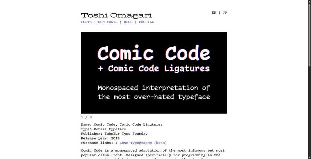
Specialists and Characters (Fonts 19–33)
Fonts that are the right answer to a specific question: maximum symbol coverage, maximum density, accessibility, prose in an editor, or simply having a personality.
19. Atkinson Hyperlegible Mono
FreeThe accessibility-first monospace. Every glyph is drawn to be impossible to mistake for another one.
The Braille Institute published six design rules for this family. Letters must be unmistakable. Straight letters like 1 I i l must look clearly different. Mirror pairs like E and F, or p and q, must be distinct. The holes inside letters must stay open. Spurs and tails are angled and lengthened to add difference. And there are their signature circular details. The list also names B against 8 and O against 0. That is a written specification for exactly the problem coding fonts exist to solve.
Two things to be honest about. First, this is not a monospaced refit of the existing Atkinson Hyperlegible; the Braille Institute describes it as an entirely new typeface with glyphs unique to it, and it was one of the most requested additions from users. Second, there is no published peer-reviewed validation that it outperforms other fonts. The principles are well grounded in legibility research. The specific font's superiority is a design claim, not a measured one.
It has a low x-height and a wide cell (0.632 em), which makes it feel roomy and slightly large. If you or a colleague struggles with small text, this is the first thing to try.
Strengths
- A published, specific disambiguation programme rather than vague claims
- Genuinely distinct 1 / I / l, 0 / O and 8 / B
- 7 weights plus true italics, on Google Fonts, in Nerd Fonts
- Free, from a non-profit, with no strings
Weaknesses
- No ligatures and no stylistic sets at all
- No independent legibility study exists
- Wide cell costs you columns
- Still on its first release
zero for the slashed zero.20. JuliaMono
Free12,337 glyphs. If your code contains real mathematics, this is not a preference, it is the only option.
Julia lets you write ∑, ∇, α and ⊗ directly in source code, which means most code fonts render your program as a field of empty boxes. JuliaMono exists to fix that, and it does so at scale: we measured 12,337 glyphs covering 11,191 Unicode code points in the Regular weight. That is roughly nine times the coverage of a typical code font.
It is also one of the most actively maintained fonts here, with four releases in July 2026 alone. The author's own note is that it will "probably never be finished".
You do not need to write Julia to benefit. Anyone doing scientific computing, LaTeX-adjacent work, APL, or heavy Unicode in identifiers gets the same payoff.
Strengths
- 12,337 glyphs, by far the widest coverage here
- Seven weights, each with a true italic
- Actively released, including four times in July 2026
- On CTAN for LaTeX use
Weaknesses
- Not a variable font
- Not on Google Fonts
- The download is large by code-font standards
- Overkill if you write ordinary ASCII code
calt, dlig, hlig and rlig, plus 20 stylistic sets.21. Departure Mono
FreeLooks like a 1998 bitmap font. Is not one. Correcting that is the most common mistake in font roundups.
Almost every article calls Departure Mono a bitmap font. It is not. The file you download is a normal outline font with no bitmaps in it at all. The pixel look comes from outlines drawn on a deliberately chunky grid, using an unusual design square of 550 units. That means it scales cleanly, which a real bitmap font cannot do. The documentation suggests using sizes in multiples of 11 pixels to keep the pixels sharp.
It is openly an aesthetic choice, inspired by early command line interfaces and late-90s sci-fi UI. Version 1.500 added around 150 box-drawing and block glyphs including part of the Symbols for Legacy Computing eighth-block range, which makes it viable for terminal user interfaces and not just screenshots.
One weight. No italic. That is the whole font.
Strengths
- A convincing pixel aesthetic that still scales properly
- Excellent box-drawing and block element coverage since 1.500
- Free, OFL, tiny download
- Nothing else looks like it
Weaknesses
- One weight, no italic, no bold
- No ligatures
- Fatiguing for long sessions unless you love the look
- Ships otf/woff only, no ttf
22. Comic Mono
FreeThe joke that turned out to work. Also the single most dyslexia-friendly thing in this article, anecdotally.
Comic Mono is a monospaced Comic Sans for code, and people keep reporting that it is the most readable font they have ever used. The evidence is anecdotal, but it is unusually consistent. The most-watched coding font video on YouTube has 357,000 views and is about paying for Comic Code. In its comments, developers with dyslexia and with failing eyesight independently say this is the font that stopped their eyes bouncing around the screen.
There is a good theoretical reason. Legibility research consistently finds that heterogeneous letterforms help decoding, and casual handwriting-derived faces are about as heterogeneous as monospace gets. This is the same principle that makes Atkinson Hyperlegible work, arrived at by accident.
Now the warning. Comic Mono contains 106 glyphs. That is bare ASCII. No accents, no Cyrillic, no Greek, no box drawing, no Powerline, no maths. Anything else falls back to another font. The bold was machine-generated. Treat it as a novelty you might fall in love with, not as production infrastructure. If you do fall in love, buy Comic Code, which is the properly drawn commercial version.
Strengths
- Genuinely easier for some dyslexic and low-vision readers
- Free, MIT licensed, 18KB
- Distinct letterforms by construction
- A real mood improver, which is not nothing
Weaknesses
- 106 glyphs. ASCII only. Everything else falls back
- The bold is machine-generated, not drawn
- No kerning table at all
- Frozen since 2019
“I have pretty severe dyslexia and I really like opendyslexic. Definitely gonna give comic mono a try.”
YouTube, Wolfgang's Channel, 299 likes
23. Sudo
FreeBuilt for very small sizes, and it has an axis that shortens the descenders so you can tighten line spacing.
Sudo is the connoisseur's pick for tiny text. The README recommends 13 pixels, and the whole design is tuned around that. Its unique feature is the YTDE axis, which shortens the descenders. If you run tight line spacing in a terminal, descenders are what collide first, and Sudo lets you dial them back instead of increasing leading. Note that version 3.6 marked YTDE as a hidden axis, so you now set it explicitly in font-variation-settings rather than picking it off a slider.
It also ships a matching proportional font, Sudo UI, drawn from the same design. Almost no coding font does that. And it has nine character variants covering the usual arguments: a two-storey g, an i and j without serifs, an l without a foot, a wider m, a dotted zero, a different 7, and a single-storey a added in May 2026.
Version 3.4 dropped static fonts entirely on the grounds that variable font support is now universal. If you use an old tool, check before you commit to it.
Strengths
- Descender-length axis, which nothing else here has
- Designed and tuned for roughly 13 pixels
- Matching proportional variant from the same design
- Actively developed with a real design revision in May 2026
Weaknesses
- Variable fonts only since 3.4, no statics
- No ligatures by design
- Not on Google Fonts yet (onboarding is stuck on technical checks)
- Small project, low profile
24. iA Writer Mono
FreeThree widths of the same design: Mono, Duo and Quattro. The best free fonts for writing prose in a code editor.
iA built three variants of one design that differ only in horizontal spacing, controlled by a custom SPCG axis. Mono is fully fixed width. Duo is duospaced: two widths, giving W and M extra room. Quattro is quattrospaced: four widths, nearly proportional but keeping typewriter-like word gaps.
Duo and Quattro fix monospace's worst readability problem for prose while keeping the rhythm that makes Markdown feel right. For READMEs, commit messages, documentation and notes they are excellent. For code they are a bad idea: variable spacing breaks column alignment in diffs and terminals.
Note that "iA Writer" and "Plex" are both reserved font names, so you can fork this freely but you must rename.
Strengths
- Duo and Quattro are the best free option for prose in a code editor
- OFL, so you can use them anywhere
- Clean Plex-derived design with five stylistic sets
- Ideal for documentation-heavy repositories
Weaknesses
- No ligatures
- Duo and Quattro break column alignment; never use them in a terminal
- Only two real weights
- No slashed zero by default
25. Inconsolata
FreeHalf a metre narrower than everything else, and the widest variable range of any font here.
Inconsolata is twenty years old and still holds a record. Its character cell is 0.5 em, tied with Iosevka for the narrowest here. That fits about 20% more characters per line than a 0.6 em font at the same size. If you live in side-by-side diffs, that is the most important number in this whole comparison.
It also has two variable axes, weight 200 to 900 and width 50 to 200, with 74 named instances. Nothing else here offers that much dimensional control, which makes it unexpectedly good for tuning terminal density.
Two honest caveats. It has no italic of any kind, which matters if your theme italicises comments. And despite recent-looking repository activity, the last human commit to main was April 2022; the 2026 pushes are automated dependency bumps sitting on unmerged branches.
Strengths
- Tied narrowest cell here, about 20% more code per line
- Two variable axes, weight and width, 74 named instances
- Slashed zero by default with both alternates available
- On Google Fonts, universally available
Weaknesses
- No italic at all
- No real development since 2022
- Smallest x-height of anything usable here
- The 7 ligatures are off by default and effectively undiscoverable
dlig, which is off by default. You have to opt in.26. Martian Mono
FreeThe widest font here by a distance, with a width axis so you can condense it back.
Martian Mono is brutalist and very wide: 0.7 em per cell, against 0.6 for the mainstream and 0.5 for Iosevka. It is a display-leaning face with a real engineering idea behind it, which is that its vertical metrics guarantee equal space above the cap height and below the baseline, so it sits perfectly centred in buttons and input fields. Glyph heights snap to the pixel grid at specific sizes.
Its rare trick is a width axis from 75 to 112.5, so you can condense it to fit more columns without switching families. Very few code fonts offer this.
An important warning if you use the Google Fonts copy: it is stale at version 1.000, which means it is missing the 40 coding ligatures added in February 2025 and the entire spacing-ligature set. Download from GitHub.
Strengths
- Width axis 75 to 112.5, unusual and genuinely useful
- Vertical metrics designed for UI components
- A spacing-only ligature mode that keeps characters literal
- Distinctive without being illegible
Weaknesses
- Widest cell here, so you lose columns
- No italics or obliques at all
- The Google Fonts build is stale and missing 40 ligatures
- One release in the last three years
rlig plus calt. There is also a 'spacing ligatures' mode (ss03) that keeps literal glyphs and only adjusts spacing.27. DejaVu Sans Mono
FreeAlready installed on your Linux box, and still has the best maths and arrow coverage of the classics.
DejaVu has not had a release since July 2016 and is still the default monospace on most Linux desktops. It ties Hack for the largest x-height here, has the widest advance of the classic fonts, and carries 112 arrows and 178 maths symbols, which is better symbol coverage than anything else in the old guard.
The italic is an actual oblique, literally named "Oblique", and it carries far fewer glyphs than the upright.
Nobody chooses DejaVu. It is what you get, and it is genuinely fine.
Strengths
- Preinstalled almost everywhere on Linux
- Best maths, arrow and box-drawing coverage of the classic fonts
- Joint-largest x-height
- Utterly stable
Weaknesses
- No release in ten years
- Oblique, not a true italic, with reduced coverage
- Wide cell costs columns
- Three-part licence that is not OFL
28. Roboto Mono
FreeEverywhere, unremarkable, and it has two real technical defects worth knowing about.
The newsworthy fact: Roboto Mono was relicensed from Apache 2.0 to SIL OFL 1.1 on 31 March 2025, as part of a wider Roboto modernisation. Any article still calling it Apache is out of date.
Two defects we found in version 3.001 that are not documented anywhere. First, the font does not declare itself monospaced (post.isFixedPitch is 0), so some font pickers and terminal emulators will not list it as a monospace option. Second, the italic's advance width does not match the upright's, a difference of about 2.2%, so mixing roman and italic in a buffer (comments, string literals) drifts out of column alignment.
It is a perfectly serviceable font with a slashed zero you cannot turn off and no kerning table at all. It is also completely everywhere, which counts for something.
Strengths
- Relicensed to OFL in 2025 and actively rebuilt
- Second-largest x-height of the Google Fonts monos
- Deliberate disambiguation: serifs on I and l, exaggerated brace points
- Ubiquitous and instantly recognisable
Weaknesses
- Does not declare itself monospaced, so some tools will not offer it
- Italic advance width does not match the roman, breaking alignment
- No ligatures, no kerning, no stylistic sets, no configurable zero
- Weight axis stops at 700
29. Ubuntu Sans Mono
FreeThe best 1 / l / I telling apart any font here, and a new release built specifically for terminal UIs.
Ubuntu Mono was reworked, converted to variable fonts and renamed Ubuntu Sans Mono in late 2023. The old Ubuntu Mono still exists as a separate family, which confuses everyone.
Its standout quality is telling apart the hardest trio in code. The l has a top-left flag and a curved bottom-right tail. The I has full serifs top and bottom. The 1 has an angled flag and a full baseline serif. All three are unmistakable, which is more than most self-described legibility fonts manage.
Version 1.100 in May 2026 added 128 box-drawing characters, block elements and the full 256-character braille range, which is a direct play for terminal user interface work.
Strengths
- Best-in-class l / 1 / I separation
- Second-narrowest cell of the mainstream fonts at 0.56 em
- May 2026 release added box drawing, blocks and full braille
- Variable weight in roman and italic
Weaknesses
- Ubuntu Font Licence, not OFL, which some organisations care about
- No ligatures
- The italic is a sloped roman, not a true italic
- Nerd Fonts coverage is unclear for the Sans Mono cut
30. Noto Sans Mono
FreeTwo variable axes including width, and the largest classic character set. No italic at all.
Noto Sans Mono has the most capable variable setup of the classic free fonts: weight 100 to 900 and width 62.5 to 100, with 36 named instances. The width axis is genuinely useful for tuning terminal density without changing typeface.
Two problems. There is no italic or oblique of any kind, which is a real limitation in editors that italicise comments. And its slashed zero cannot be turned off: the font registers a zero feature, but the alternate glyph it points to is a composite whose only component is the original zero, so the feature does nothing. There is no dotted or plain alternate at all.
Like Roboto Mono, it does not declare itself monospaced, so some tools will not list it.
Strengths
- Weight and width axes, 36 named instances
- Largest character set of the classic free fonts
- Part of the Noto project, so script coverage is exhaustive elsewhere in the family
- Slashed zero by default
Weaknesses
- No italic or oblique in any form
- The zero feature is a no-op; you cannot change the zero
- Does not declare itself monospaced
- No family release since September 2023
31. Space Mono
FreeA display typeface wearing a code font's clothes. Use it for headlines, not for eight-hour sessions.
This one needs a straight answer, because it appears in almost every "best coding fonts" list and it should not. Its own README calls it a "monospace display typeface family" and the launch announcement says it was created specifically for headline and display typography.
Concretely: 765 glyphs, the smallest set here. No alternates and no zero feature, so the dotted zero is what you get. A single-storey a, which slightly weakens the a / o / d distinction. And a 1 with no base serif, which is the weakest disambiguation in the article.
It is beautiful. Use it on your landing page, in your logo, in terminal screenshots for marketing. Do not use it to ship software. The repository was archived in 2025.
Strengths
- Genuinely striking at large sizes
- The most thoroughly redrawn true italic here
- Perfect for developer-tool branding and hero text
- On Google Fonts
Weaknesses
- It is a display face; the makers say so
- Weakest character disambiguation in this article
- 765 glyphs, no alternates, no zero feature
- Repository archived, no further development
32. Anonymous Pro
FreeA lovely piece of history with a genuine flaw: its l and I are nearly identical.
Anonymous Pro traces back through Simonson's Anonymous (2001) to Anonymous 9, a mid-1990s Macintosh bitmap font. It is charming, compact and still perfectly usable in an editor.
Two things stop it being a recommendation. Its l and I share an identical full-width bottom serif and differ only in the width of the top serif, which is the weakest uppercase-i separation here. And its box-drawing coverage is 40 characters out of 128, with no block elements at all, so it falls apart in htop, tmux borders and any terminal user interface.
Its x-height is 0.455 em, so it reads small; most users end up bumping it a point or two.
Strengths
- Real typographic character with a genuine lineage
- Very compact, only 624 glyphs, tiny download
- Free on Google Fonts
- A 'Minus' variant without embedded bitmaps is available
Weaknesses
- l and I are nearly indistinguishable
- Box drawing is incomplete and there are no block elements
- No ligatures, no variable font, no OpenType features at all
- Nothing has changed in roughly 15 years
33. Fragment Mono
FreeIf you have ever wanted to write code in Helvetica, this is the only credible answer.
Fragment Mono descends from Helvetica by way of Nimbus Sans (the libre clone that makes an OFL release legally possible). It was monospaced, given ligatures based on JetBrains Mono and Fira Code, extended, and spaced to match SF Mono, which means it drops neatly into a macOS terminal.
Two hard limitations. There is no bold, which breaks any syntax theme that relies on it. And Helvetica's famous I / l / 1 ambiguity is exactly the problem code fonts exist to fix; the font ships stylistic sets ss03 to ss07 specifically to give you alternates, which is an honest admission.
Take it from GitHub, not Google Fonts: the Google build is the older 1.011 with 587 glyphs, no small caps, no Powerline and no box drawing.
Strengths
- The Helvetica look, legally, for free
- 81 ligatures and small caps in a two-style font
- Spacing matched to SF Mono
- Powerline and box drawing in the GitHub build
Weaknesses
- No bold weight at all
- Inherits Helvetica's I / l / 1 ambiguity by design
- The Google Fonts copy is stale and much smaller
- Two styles only
calt.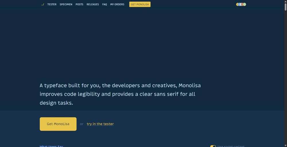
The Paid Tier (Fonts 34–41)
Worth understanding even if you never buy one. Read the licence section of each, not just the price: licensing blocks more of these sales than cost does.
34. MonoLisa
PaidThe best-known paid coding font, and the one whose price the internet argues about most.
MonoLisa's core idea is width. Its letters are drawn slightly wider than a typical monospaced font, so shapes like m feel less cramped. In practice that makes it excellent for teaching, screen sharing and conference talks, which is exactly where its fans are loudest. Version 3 arrived in June 2026 and added MonoLisa Text, a matching proportional font.
Pricing as of 25 July 2026, read off the checkout pages: the Developer licence is $149 and covers MonoLisa Code only, and Code plus Text was listed at $199. Commercial use runs through the Creator tier at €49 per weight, with multipliers for licence type and company size that can push a full superfamily with all-media rights into four figures. There is a free trial with two weights, no ligatures and no OpenType features. Note that MonoLisa renders its prices client-side and localises them at checkout, so what you are shown may differ from what is quoted here.
The recurring complaint, beyond price, is the EULA: it forbids adding or removing glyphs, converting formats, or making derivative works, which rules out subsetting and Nerd Font patching. A MonoLisa team member replied publicly on Hacker News in June 2026 that the wording is strict to prevent resale and that they see no problem with subsetting or customising. That was a forum post, not a licence amendment.
Strengths
- Wider glyphs genuinely help legibility on a projector or a shared screen
- 10 weights with italics, variable, plus a Grade axis
- Broadest script coverage of the paid fonts, including Hebrew and Armenian
- Free trial, active development, public issue tracker
Weaknesses
- $149 is the highest entry price of any font here
- The written EULA forbids subsetting and Nerd Font patching
- Reported rendering weaknesses on non-HiDPI Windows displays
- Personal licence does not cover your company's website
“Umm... Who would pay $149 to use a font? Maybe I'm not enough of a typography nerd, but I find the free choices quite enough.”
Hacker News, June 2026, in the most-discussed paid-font thread of the year
35. Berkeley Mono (TX-02)
PaidThe most admired paid font in developer circles, and the most confusing thing to actually buy.
First, the naming, because everyone gets this wrong. TX-02 is simply the product code for Berkeley Mono version 2. It is not a different font, and the font was not renamed. What changed is the company: Berkeley Graphics became U.S. Graphics Company. Version 2 shipped on Christmas Day 2024 with the core letters completely redrawn.
The design is Eurostile, OCR-B and DIN filtered through a technical-manual aesthetic, and it is genuinely distinctive in a field of neutral grotesques. It comes in 5 widths and 12 weights, which is 120 styles, with a three-axis variable font.
Now the part that trips people up. The advertised "$75" buys four styles with no ligatures. Ligatures are a $20 module. The 100-style master set is $50. Web fonts are $45. Variable fonts are $25. That is $215 for a fully specified personal licence, or $260 once you add the $45 Supertype compiler. Commercial use is a separate purchase starting at $225 for a sole proprietor. There are no refunds "for any reason". The free trial lasts 7 days and deliberately swaps / with \ and * with #, which the vendor warns you about in capitals.
The other blocker, and it comes up in every thread: the written licence forbids modification, which means no Nerd Font patching. The designer has said publicly that the full version has "no issue with patching". Another buyer reports being told the opposite. Get it in writing before you buy if this matters to you.
Strengths
- Genuinely distinctive technical aesthetic that nothing free replicates
- 5 widths and 12 weights, 120 styles, three variable axes
- One-time purchase, and version 1 buyers got version 2 free
- Employer-owned machines are explicitly covered on the personal tier
Weaknesses
- The headline $75 buys 4 styles with no ligatures; a fully specified personal licence is $215
- Written licence forbids patching, contradicting the designer's public statements
- No Cyrillic, a long-standing complaint
- No refunds, and a deliberately sabotaged 7 day trial
“I find the yearly / per-seat pricing for commercial use very hostile. Nobody wants to be chasing bills for a single typeface.”
Hacker News, Show HN: Berkeley Mono
36. Comic Code
PaidThe best value in paid coding fonts, and the one with the strongest unpaid accessibility testimonials.
$30 buys twelve fonts: Regular, Italic, Medium, Medium Italic, Bold and Bold Italic in both the standard and the ligature family. That is the cheapest serious paid coding font in this article by a wide margin, and unlike Comic Mono it has properly drawn italics and real bold weights rather than machine-generated ones.
It reached a wide audience through a single YouTube video with 357,000 views arguing for paying for a terminal font, and the comments under it are the most persuasive accessibility evidence in the whole research corpus. Multiple developers with dyslexia and with deteriorating eyesight independently report that this is the font that made long sessions comfortable.
The obvious objection is that it looks like Comic Sans on a shared screen, and you should take that seriously if you pair-program or present. The other objection is that Comic Mono is free and pretty good.
Strengths
- $30 for 12 fonts, the best value paid option here
- Real drawn italics and bold, unlike the free clone
- The strongest unpaid accessibility testimonials in the research
- Free demo weights, permanently
Weaknesses
- It looks like Comic Sans to anyone glancing at your screen
- Licence is personal and cannot be shared or transferred, so buy per seat
- Broadcasting is explicitly excluded, which matters if you stream
- Per-seat pricing above the entry tier is not published
“Damn never thought someone would manage to sell me a comic font.”
YouTube, Wolfgang's Channel, 1,700 likes
37. Operator Mono
PaidThe font that made cursive italics a thing in code editors. Priced per computer, per user account.
Operator's italic is a real handwriting script, not just a tilted version of the normal letters. Jonathan Hoefler has said he pushed for it partly because he is red-green colourblind. The idea is that you can tell parts of your code apart by shape instead of relying on colour alone. That is a genuine accessibility argument, and no other font here makes it.
The licensing is the strictest in this article. A "computer" is defined per user account, so your work laptop and your home desktop are two licences ($248). Web fonts are a separate annual subscription. App embedding is another. @font-face is explicitly forbidden. There is an audit clause allowing inspection with ten days' notice.
And it has no programming ligatures. There is a well-known third-party patch that adds them, which almost certainly violates the no-modification terms.
Strengths
- The original and still the most refined cursive italic in code
- A genuine colourblindness accessibility rationale
- Ten fixed-width styles from ExtraLight to Bold with italics
- Foundry-grade drawing quality
Weaknesses
- No programming ligatures at all
- Licensed per user account per machine; two machines is $248
- @font-face forbidden, web and app embedding are separate subscriptions
- Thin language coverage and an audit clause
38. PragmataPro
PaidExtreme density and 18,000 glyphs. If you want the most information on screen, nothing else is close.
PragmataPro is the density champion. The Regular now exceeds 18,000 glyphs, the letterforms are very narrow, and the design has explicitly no interline spacing, so you fit an unusual amount of code on screen. It also ships a 12,000-symbol "Semiotics" set, CJK-compatible metrics and five family variants.
Pricing is per company size and starts at €19 for the Essential tier, which is one weight, English only, and no ligatures. The realistic developer purchase is €59 for one full weight or €199 for all weights. The variable font released in 2025 is a separate €299 product and is not included in the collection.
Read the update policy carefully. Free updates are promised "until version 1.0", after which only bug fixes are free. The font has been below 1.0 for over fifteen years.
Strengths
- 18,000 plus glyphs, unmatched symbol coverage
- The densest usable code font available at any price
- €19 entry point, the cheapest way into a paid font
- Actively developed after fifteen years
Weaknesses
- The €19 tier has no ligatures and English only
- The 2025 variable font is a separate €299 purchase
- Very narrow letterforms divide people sharply
- No trial at all, and the pricing table has non-monotonic oddities
39. Input
FreeThe most widely mis-described licence in the field. It is free for professional work, including at your job.
Almost every article says Input is "free for personal use, paid for commercial use". That is wrong. The licence covers "any use on your own computer that involves computer programming, software development, or the composition of plaintext documents in personal, professional, or non-professional contexts". It also specifically allows you to publish screenshots of your editor.
What you pay for is publishing or distributing the font: rich text and PDF output, webfonts, app embedding, or bundling Input with software. Desktop licences start at $5 for a single style and run to $200 for all 168 styles. Web licences are annual.
Input's other distinction is that it is the credible proportional coding font. Input Sans has a wide word space specifically so that alignment stays readable in code, which is the usual failure of proportional code fonts. The trade-off is that proportional text makes vim motions and column selection unpredictable, and it cannot be used in a terminal at all.
Strengths
- Free for professional software development, including at work
- Customise before download: alternate a, g, i, l, 0, braces and line spacing
- 168 styles across Mono, Sans and Serif in four widths
- The best-documented set of code-specific glyph decisions anywhere
Weaknesses
- Cannot be used as a webfont without a paid licence
- No ligatures and no variable font
- The proportional cuts break vim motions and terminal alignment
- The 2014 design reads dated next to newer paid fonts
40. MD IO
PaidThe friendliest licence in paid type, and you cannot find out what it costs without asking.
MD IO is built around large functional ink traps and tight vertical metrics tuned for 11 to 13 pixel rendering, which is exactly where most code fonts get muddy. It is one of the few paid fonts drawn specifically for small on-screen sizes rather than scaled down from a display design.
Its licensing is the best in this article by some distance. One-time and perpetual, priced by company headcount rather than seats, traffic or installs. One commercial licence covers desktop, web, apps, games and logos. Sharing with contractors is explicitly allowed. Modification is permitted. The restrictions are unusual and worth knowing: no hate speech, and no AI model training.
And yet: there is no price anywhere on the website. Not on the product page, not on the licensing page, not in a store. The only number the foundry has ever published is €50 per style. The trial is unrestricted and unsubsetted, which is the best trial here.
Strengths
- One perpetual licence covers desktop, web, apps, games and logos
- Priced by headcount, not per seat, and contractors are included
- Modification and subsetting explicitly permitted
- Unrestricted, unsubsetted trial fonts
Weaknesses
- No published price at all; you have to make contact
- The variable font is only included with full-family orders
- Ink traps are polarising at larger sizes
- Small foundry, low community footprint
41. Cartograph CF
PaidA monospace that does not look like a terminal, with a true cursive italic and a proportional companion built in.
Cartograph is the pick if you want one typeface for your code and the marketing site next to it. Sixteen styles, eight weights, a genuinely cursive italic, and unusually a proportional (non-monospaced) set accessible through OpenType features rather than as a separate family.
The licence is the strictest here for a freelancer. One device per authorised user, so a laptop and a desktop is two users. Authorised users must be "your employees", which means contractors are not covered. Web and app licences renew annually even though the desktop licence is one-time. Embedding in open-source software is explicitly prohibited. Video, broadcast and streaming are not addressed at all, which is a real grey area if you screencast.
Strengths
- True cursive italic plus a proportional set in the same purchase
- Eight weights, wide script coverage including Katakana
- Free demo available and included with Adobe Fonts
- Reads as a design typeface, not a terminal typeface
Weaknesses
- One device per user, so two machines costs double
- Contractors are not covered by the licence
- Web and app licences auto-renew annually
- Streaming and video are simply not addressed
Should You Use Font Ligatures for Programming?
Font ligatures join two or three characters into one shape. So != becomes a single "not equal" symbol, and => becomes an arrow. Some developers love this. Others hate it. Here is what is actually true.
What Both Sides of the Ligature Debate Agree On
A ligature never changes your file. The bytes on disk stay the same. Your diff, your grep and your compiler all see the plain characters. Only the picture on screen changes.
A ligature also never changes the width. A three-character ligature still takes up three character cells. This is the most common wrong objection, and pro-ligature developers have had to correct it in nearly every thread for eight years.
Is There Any Research on Programming Ligatures?
No. None at all. We searched the academic literature and the OpenAlex database with several different phrasings. There is no study, in either direction, on whether programming ligatures help or hurt. There is also no study comparing coding typefaces for reading code, and no study on monospace versus proportional fonts for code. If someone quotes you a percentage, they made it up.
The Best Argument for Coding Ligatures
Nikita Prokopov, who made Fira Code, puts it simply. Your brain already treats -> and <= as single ideas. They only take two characters because of old keyboards, not because two characters is the clearest way to show them. So your eye does a small amount of work joining them back up, every single time. A ligature does that work for you.
The strongest version of this came from a working type designer, in the top comment on the JetBrains Mono launch thread with 452 upvotes. Ligatures are useful, he said, because they turn something your brain already reads as one token into one shape.
The Best Arguments Against Coding Ligatures
Here is what surprised us. Almost nobody argues that ligatures look bad or are hard to read. Every serious objection is about editing, not reading.
- You lose track of where characters start and end. The top substantive complaint on r/neovim, at 75 upvotes, was from someone who turned ligatures off because when editing character by character, they had to stop and work out which part was the
!and which was the=. - Typing stops matching the cursor. "If I type 3 characters I want the cursor to advance 3 spaces forward." That comment got 86 upvotes. It is a fair complaint about a real thing.
- Some languages break, and this one cannot be argued away. In VHDL,
<=means "assign this signal", not "less than or equal". In Elixir,|>is a pipe. Your font does not know which language you are in, so it draws the wrong meaning. - You cannot tell ASCII from Unicode any more. This is Matthew Butterick's argument, and it is the sharpest one. If
!=is drawn to look like≠, you can no longer tell by eye whether you are looking at two plain characters or one special one. A code font is supposed to stop different characters looking the same. Ligatures do the opposite. His essay has reached the front page of Hacker News at least four times since 2017. - The shapes move while you type. In some editors, a ligature comes apart when your cursor passes over it, so the line visibly shifts. Kitty has a setting just for this:
disable_ligatures cursor.
Should You Turn Ligatures On?
The most quoted comment on the whole topic, at 62 upvotes, points out that this can never become tabs versus spaces. Your font setting is yours alone. Nobody else has to live with it. That is why the shouting is mostly for show.
Our advice, after reading a few thousand comments:
- If you mostly read code, ligatures probably help you a little.
- If you do a lot of character-level editing, especially in vim, they probably cost you a little.
- If you write VHDL, Elixir or F#, turn them off. Or use 0xProto, which joins characters without changing their shape.
- Try them for two weeks before you decide. Getting used to them is real, and it works both ways.
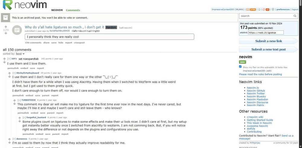
What the Research Says About Font Legibility
Font makers love words like "legibility" and "cognitive load". Some of that is backed by real research. A lot of it is not. Here is what the evidence actually shows, including the parts that go against what people usually say.
Is There a Single Best Coding Font?
No, and this is the most important finding in the whole field.
Wallace and colleagues (2022) tested 352 people across 16 fonts. They were careful about one thing most comparisons get wrong: they matched the fonts by how big they look, not by point size. What they found:
- People read 35% faster in their best font than in their worst. That is 314 words per minute against 232.
- There was no overall winner. Every font in the test was somebody's fastest font.
- People could not tell which font was best for them. They read fastest in the font they preferred only about a fifth of the time, and slowest in it about as often. Most were sure their favourite was best.
Put those together and you get something useful. Your font choice matters a lot to you personally. Your opinion about which font is best is almost worthless as evidence. So try fonts properly, in your editor, at your size, for a week. Do not pick one from a list like this on a hunch.
Which Letter Shapes Actually Improve Legibility?
From a 2022 review of readability research by Beier and colleagues:
- Even stroke thickness helps you recognise words.
- Simple letter shapes help you recognise letters.
- Squashed, narrow letters hurt.
- Very heavy and very light weights both slow you down.
- Wider letters are easier to spot out of the corner of your eye.
That last point matters more for code than it sounds. Eye-tracking work by Busjahn and colleagues (2015) found that experienced developers looked at only 41.3% of the parts of a piece of code. Beginners looked at 52.4%. For comparison, beginners reading ordinary prose looked at 83.5% of the words.
In other words, experts do not read code. They scan it and jump around. So what matters is how distinct a chunk of code looks when you are not staring straight at it. That is a different job from being comfortable to read line by line.
The Font That Was Supposed to Improve Memory
In 2018 RMIT University released Sans Forgetica. It was deliberately hard to read, and the claim was that the extra effort would help you remember what you read. It got huge press coverage.
It has since failed four separate replication attempts. Taylor and colleagues (2020) ran four experiments with 882 people and found memory was the same or worse. Geller and colleagues (2020) found the same. So did Wetzler and colleagues (2021). Cushing and Bodner (2022) found it actually made people worse at spotting errors when proofreading.
The lesson carries straight over to coding fonts. A font that feels carefully engineered is not proof that it does anything. Keep that in mind when you read a font's marketing page.
What Font Size Should I Use for Coding?
Reading speed stays flat across a surprisingly wide range of sizes. Legge and Bigelow's 2011 review found the comfortable range covers roughly a tenfold difference in letter size.
The risk is not that you pick 14px instead of 15px. It is that typical developer settings, around 11 to 14px at arm's length, sit near the bottom of that range. That is where small problems start to cost you.
A good starting point is 14 to 16px on a normal-density screen. Go bigger if you sit further back. Then check it by eye rather than by the number, because two fonts at the same size can look very different.
What Line Height Should I Use for Code?
Somewhere between 1.4 and 1.6. Three completely separate sources land in the same place:
- Accessibility guidance. WCAG 1.4.8 asks for at least 1.5 line spacing.
- Safety-critical typography. NASA's 1992 report on cockpit documents says line spacing should be at least 25 to 33% of the font size, so lines do not blur into each other.
- Measured experiments. Dobres and colleagues (2018) found narrower line spacing cost 8.9% more reading time than wider spacing.
Most editors default to less than this. VS Code works out to about 1.35 on Windows and Linux, and 1.5 on macOS.
Which Matters More, Font Size or Line Height?
Size, clearly. The same 2018 study measured all three levers under quick-glance reading, which is much closer to how people scan code than prose studies are:
- Going from 3mm to 4mm text cut the time needed by 26.7%.
- Wider line spacing helped by 8.9%, so roughly a third as much.
- Crowded blocks of words needed 95.4% more time than words shown on their own.
So: make the text bigger first, then open up the line spacing. And notice that crowding is the biggest cost of all. Code is a crowded block of text by its nature, which is exactly why line height is not just decoration.
Is Dark Mode Better for Your Eyes?
Probably not, and the honest answer is more interesting than either side claims.
The classic result is that dark text on a light background wins. Buchner and Baumgartner (2007) found better proofreading on light backgrounds, whatever the room lighting. Piepenbrock and colleagues repeated it in 2013 and 2014 with younger and older adults, and found the advantage grows as text gets smaller.
But there is one study almost nobody mentions, and it changes the answer. Buchner, Mayr and Brandt (2009) matched the total brightness of the light and dark screens. When they did, the advantage disappeared completely. Their conclusion was blunt: the polarity itself does not affect readability. What was really happening is that brighter screens make your pupils narrower, which sharpens your vision. It was a brightness effect wearing a dark mode costume.
On eye strain specifically, the evidence for either mode is thin. Buchner and Baumgartner measured breathing rate, heart rate, skin conductance and people's own reports of eye strain and tiredness. They found no difference at all between light and dark. A 2025 tablet study found dark mode slightly better on two physical measures, but found no difference on the main question of how tired people felt, with only 30 participants.
The practical answer: use whichever theme you like. Make sure the text is bright enough and big enough. Your font is a small lever on eye strain. Text size, screen brightness, how far away you sit and how often you blink are big ones.
How Long Should a Line of Code Be?
80 characters is the usual answer, and it has two good reasons behind it. Accessibility guidance (WCAG 1.4.8) specifically says no more than 80 characters. And it fits side-by-side diffs, terminals and code review tools.
What it does not have is any research on reading code. The famous "45 to 75 characters" figure comes from studies of prose, where your eye sweeps back to the start of each line. Experts do not read code that way at all. Rust enforces 99 characters. Go decided not to set a limit.
Coding Fonts for Dyslexia, Accessibility and Eye Strain
This section is short, because the evidence is clearer than the marketing suggests. It also points somewhere most people do not expect.
Do Dyslexia Fonts Like OpenDyslexic Work?
No. They have been tested, and they failed.
- Wery and Diliberto (2017) compared OpenDyslexic against Arial and Times New Roman. Students with dyslexia read no faster and made no fewer mistakes.
- Kuster and colleagues (2018) tested the Dyslexie font on 170 children, then on another 147. They controlled line spacing and letter size so they were testing the letter shapes alone. No faster reading. No better accuracy. The children preferred Arial.
- Rello and Baeza-Yates (2013) eye-tracked 48 people with dyslexia across 12 fonts. OpenDyslexic came out poorly and people did not like it.
Two things from that last study matter here. Monospaced fonts did well, which is rare direct support for the whole idea of coding in a fixed-width font. And italics made reading clearly worse. That is worth a thought if your theme puts every comment and keyword in italics.
What Actually Helps Developers With Dyslexia
Spacing. Not letter shapes.
Zorzi and colleagues (2012) tested 74 children with dyslexia in two languages, simply by adding extra space between letters. Errors roughly halved. Reading speed improved by about as much as a normal child gains in a full school year. The effect did not show up in children without dyslexia, and it was strongest in the children who struggled most with picking out letters. The reason is crowding: letters stop crushing each other.
So if you or a teammate has dyslexia, the changes worth making are letter spacing, line height and font size. All three are settings in your editor, and they work with any font at all. Installing a special dyslexia font is the one option with evidence against it.
There is a happy accident here too. Monospaced fonts are already generously spaced, because narrow letters get padded out to fill their cell. That may be an accidental accessibility win for the whole format.
Do Developers With Dyslexia Read Code Differently?
Yes, but not in the way you would guess. McChesney and Bond (2018) eye-tracked 28 developers, half of them dyslexic, reading and explaining real programs. Their finding was that these developers did not behave the way the dyslexia research on ordinary text predicts. A follow-up study in 2020 found no real difference in how the two groups moved through code.
This is an under-used pair of studies, and it is a good reason to be careful about copying prose findings straight into code.
Which Coding Fonts Have a Real Accessibility Case?
- Atkinson Hyperlegible Mono. Made by the Braille Institute, with a published list of the exact letter pairs it keeps apart:
1 I i l,EandF,pandq,Band8,Oand0. There is no published study proving it beats other fonts, and we should say that. But its design rules match what the research supports. - Intel One Mono. Drawn by Frere-Jones Type with a panel of low-vision and legally blind developers giving feedback at every stage.
- Comic Code and Comic Mono. The evidence here is anecdotal, but it is remarkably consistent, and it comes from people with nothing to sell. Handwriting-style letters are all different from each other by nature, and that difference is exactly what research finds helps people decode text.
- Operator Mono. Its cursive italic exists partly so you can tell code apart by shape rather than colour. The foundry has linked this to red-green colourblindness. Cascadia Code's
ss01italic gives you the same effect for free.
One Thing to Check That Is Not the Font
Syntax highlighting themes very often fail the accessibility contrast minimum of 4.5 to 1. The usual culprits are grey comments and "muted" tokens. If code feels hard to read, measure your theme before you blame your typeface.
How to Change Your Coding Font
Everything below was checked in July 2026 against each tool's own documentation, and where the docs were vague, against the source code itself.
Change the Coding Font in VS Code (and Cursor, Windsurf)
Cursor and Windsurf are built on VS Code and use the same settings, so this works for all three. One warning: if your fork is based on a VS Code older than 1.97, the terminal ligature settings will not exist yet.
{
  "editor.fontFamily": "'JetBrains Mono', 'Cascadia Code', Menlo, Consolas, monospace",
  "editor.fontSize": 14,
  "editor.fontWeight": "400",

  // String form is passed straight through as CSS font-feature-settings.
  // It REPLACES the default, so you must re-list calt and liga yourself.
  "editor.fontLigatures": "'calt' 1, 'liga' 1, 'ss01' 1, 'zero' 1",

  // Variable font axes. Needs a variable build of the font.
  "editor.fontVariations": "'wght' 420",

  // Below 8 this is a multiplier. 8 and above it is raw pixels. 0 is the default.
  "editor.lineHeight": 1.6,

  "terminal.integrated.fontFamily": "'JetBrainsMono Nerd Font Mono', monospace",
  "terminal.integrated.fontSize": 13,
  "terminal.integrated.lineHeight": 1.2,
  "terminal.integrated.fontLigatures.enabled": true,
  "terminal.integrated.fontLigatures.featureSettings": "'calt' on, 'liga' on"
}
Three things people get wrong
editor.lineHeightchanges meaning at 8. A value of 1.6 means "1.6 times the font size". A value of 8 means "8 pixels". Always use the small multiplier form.- The default line height depends on your operating system. VS Code uses 1.5 times the font size on macOS and 1.35 everywhere else. So the same settings file really does give you different spacing on a Mac and a PC.
- Using a string for
fontLigatureswipes the defaults. Writing"'ss01' 1"turns on stylistic set one and quietly kills your ligatures, becausecaltis no longer in the list. You have to name every feature you want.
Terminal ligatures are newer than most people realise. They arrived as a preview in VS Code 1.96 in November 2024 and became stable in 1.97 in January 2025.
Change the Coding Font in JetBrains IDEs
Settings, then Editor, then Font (Ctrl+Alt+S on every platform). The ligature checkbox is right there, labelled "Enable font ligatures". Next to it is a Typography Settings dialog with main weight, bold weight, fallback font and Character variants, which is where OpenType stylistic sets appear.
One correction to advice you will find elsewhere. JetBrains gives you a list of checkboxes for the stylistic sets it finds in your font. There is no text box where you can type 'zero' 1, 'ss01' 1. Line height is a multiplier and defaults to 1.2. The terminal has its own font settings under Tools, then Terminal.
Change the Coding Font in Neovim and Vim
In a terminal, Neovim has no font setting at all. Your terminal owns the font, the ligatures and the fallback for missing characters. Typing :set guifont=... in a terminal session is valid and does absolutely nothing. So if your icons are missing, set the Nerd Font in your terminal. And if you want ligatures but use Alacritty, no Neovim config will help you.
Neovide is different. It draws text itself, so it does render ligatures:
vim.o.guifont = "JetBrainsMono Nerd Font:h14"
-- with fallback, hinting and edging in the guifont string:
vim.o.guifont = "Hack,Noto_Color_Emoji:h14:#e-subpixelantialias:#h-slight"
Note that the old g:neovide_font_hinting and g:neovide_font_edging settings no longer exist. Those options moved into the guifont string. Plenty of tutorials still recommend them anyway.
Change the Coding Font in Zed
{
  "buffer_font_family": "JetBrains Mono",
  "buffer_font_size": 14,
  "buffer_font_features": { "calt": true, "ss01": true },
  "buffer_font_fallbacks": ["Symbols Nerd Font Mono"],
  "buffer_line_height": { "custom": 1.5 }
}
Zed's default is .ZedMono, which since August 2025 resolves to Lilex, not the old Iosevka-derived Zed Mono. The original zed-fonts repository was archived in February 2026. Zed Plex Mono was withdrawn because IBM's OFL declares "Plex" a reserved font name, which makes a derivative called "ZedPlexMono" non-compliant. Two gotchas: buffer_line_height defaults to "comfortable", which is 1.618, much looser than VS Code; and buffer_font_features is documented as macOS and Windows only, so Linux users get no OpenType feature control.
Change the Coding Font in Sublime Text
Sublime works backwards from everything else. Ligatures are on by default, and you switch them off rather than on.
{
  "font_face": "JetBrains Mono",
  "font_size": 12,
  "font_options": ["no_calt", "no_liga", "subpixel_antialias"],
  "line_padding_top": 2,
  "line_padding_bottom": 2
}
Officially documented values are dlig, no_liga, no_clig and no_calt. Arbitrary tags like ss01 are reported to work in practice but are not in the docs. On Linux this needs Pango 1.38 or newer.
Change the Font in Your Terminal (and Which Ones Do Ligatures)
| Terminal | Ligatures | Config | Built-in icons |
|---|---|---|---|
| Ghostty 1.3.1 | On by default | key = value | Nerd Font symbols built in |
| Kitty 0.46.2 | On, with disable_ligatures | kitty.conf | Built-in Nerd Font |
| WezTerm | On, disable via harfbuzz_features | Lua | Via fallback |
| iTerm2 3.6.11 | Opt-in checkbox | GUI | Built-in Powerline glyphs |
| Windows Terminal | Via font.features | settings.json | No |
| Alacritty | No, by design | TOML | Box drawing only |
| macOS Terminal.app | No | GUI | No |
Alacritty's answer is settled and official. The maintainers say building ligatures is not the hard part, building them properly is, and they tell people who really want ligatures to use a different terminal. So if ligatures matter to you, that is a terminal choice, not a font choice.
Kitty has the most useful ligature setting anywhere: disable_ligatures cursor. It hides the ligature only under your cursor. That completely solves the "the shapes move while I type" complaint, and it is worth knowing about even if you use a different terminal.
# Ghostty  ~/.config/ghostty/config
font-family = JetBrains Mono
font-size = 13
font-thicken = true          # macOS stroke thickening, fixes "too thin"
font-variation = wght=450
# font-feature = -calt       # uncomment to kill ligatures
adjust-cell-height = 10%

# Kitty  ~/.config/kitty/kitty.conf
font_family      JetBrains Mono
font_size 13.0
font_features JetBrainsMono-Regular +zero +ss01
disable_ligatures cursor     # never | cursor | always
modify_font cell_height 110%

# Alacritty  ~/.config/alacritty/alacritty.toml
[font]
size = 12.0
[font.normal]
family = "JetBrainsMono Nerd Font"
[font.offset]
y = 2                        # this is the line spacing knob
Do You Still Need Nerd Fonts?
Nerd Fonts takes existing coding fonts and adds more than 10,000 icons to them. It is what makes the icons work in Starship, Powerlevel10k, LazyVim and most Neovim plugins. About 67 font families come ready-patched, so you rarely need to patch one yourself.
Which Nerd Font variant should you download?
- Nerd Font Mono squeezes every icon into exactly one cell. Use this in terminals. Column alignment stays intact.
- Nerd Font (no suffix) lets icons span roughly one and a half to two cells. Bigger and clearer. Use in GUI editors where the grid does not matter.
- Nerd Font Propo keeps icons at their natural proportional width. Not for terminals.
Installing on macOS, and note the step almost every tutorial still gets wrong:
# The tap no longer exists. DELETE this line if you see it anywhere:
#   brew tap homebrew/cask-fonts

brew install --cask font-jetbrains-mono-nerd-font
brew install --cask font-hack-nerd-font
brew search nerd-font
Homebrew folded the fonts tap into core cask in 2024 and the old repository now returns a 404. On Linux, download the zip from the release and run fc-cache -fv; Arch ships a 69-package group named nerd-fonts with the naming convention ttf-<font>-nerd. On Windows, oh-my-posh font install is the easiest route.
Two honest notes for 2026. Nerd Fonts has not released a new version since 3.4.0 in April 2025, which is fifteen months, although work continues weekly in the repository. And the two most modern terminals have made patching mostly unnecessary. Kitty ships with a built-in Nerd Font and its FAQ says plainly that patching damages fonts and there is no need for it. Ghostty has the same built-in fallback. If you use either, try it without a patched font first.
Coding Fonts on the Web
pre, code, kbd, samp {
  font-family: 'JetBrains Mono', ui-monospace, SFMono-Regular, Menlo, Consolas, monospace;
  font-size: 0.9375rem;
  line-height: 1.6;

  /* Preferred: high level, semantic, standardised */
  font-variant-ligatures: contextual common-ligatures;

  /* Low level escape hatch, for things font-variant cannot express */
  font-feature-settings: 'ss01' 1, 'zero' 1;
}
Coding ligatures nearly always live in calt, so font-variant-ligatures: contextual switches them on and no-contextual switches them off. Save font-feature-settings for stylistic sets, character variants and the slashed zero, because those have no simpler equivalent. Both properties pass down to child elements, and font-feature-settings is all or nothing: setting it again on a child replaces the whole list instead of adding to it.
If you preload a font, the crossorigin attribute is required even when the font is on your own domain. Leave it off and the browser downloads the font twice. It is a classic silent performance bug.
What Developers Actually Say About Coding Fonts
We read the threads rather than summarising other summaries. A few findings worth stating plainly.
There is no survey data. None. The Stack Overflow Developer Survey has never asked about fonts or ligatures, and neither has the JetBrains State of Developer Ecosystem. Any percentage you see quoted about ligature adoption is invented. All real sentiment lives on Hacker News, Reddit and YouTube.
Coding fonts have essentially no presence on review platforms. MonoLisa, the most prominent paid product in the category, has two reviews on Product Hunt and no G2 listing. There is no Trustpilot page for any of the major vendors. The one substantial user rating anywhere is Dank Mono's 4.9 from 390 Gumroad ratings, and that font's own website has been returning a server error for over a year. Hacker News comment threads are, functionally, the review platform for paid coding fonts.
The free-clone reflex is now instant. Someone posts a screenshot, someone identifies the paid font, someone balks at the price, and within minutes a free lookalike is linked. Berkeley Mono gets Ioskeley. MonoLisa gets Maple Mono. Comic Code gets Comic Mono. Often with "the shape of a font is not copyrightable" attached, which is true in the United States and is not the whole story elsewhere.
Licensing blocks more paid-font purchases than price does. The Show HN thread for Berkeley Mono is dominated by licence complaints rather than design discussion, and the specific blocker that comes up again and again is Nerd Font patching. Forbidding modification removes exactly the audience most willing to pay.
Purchasing power is a real and under-covered objection. Two separate quotes from the research: "20k for a font for someone living in India is too much to ask", and, on a $75 font, "I don't think it's worth 3 months worth of grocery". Vendors' regional pricing systems reportedly misfire, geolocating buyers to the wrong country.
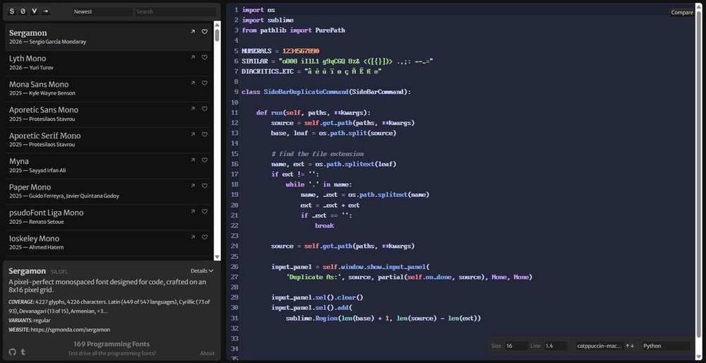
The most self-aware comment in the entire corpus, and the top reply on the Monaspace thread with 225 upvotes, is worth ending on: someone joking that the only reason they chose this career was to play with monospace fonts all day, and that a critical feature can wait three hours while they browse "best programming font" blogs only to settle on the font they were already using. If that is you, the font lab above will at least make it a faster three hours.
New Coding Fonts Released in 2025 and 2026
The public catalogue at programmingfonts.org now runs to roughly 180 coding fonts. Here is what has arrived recently, beyond the fonts reviewed above.
- Google Sans Code (Google with Universal Thirst, on Google Fonts since November 2024). A monospaced version of Google Sans, built in Google's words "for products like Gemini and Android Studio". Free, OFL, weight axis 300 to 800, already on version 7. Its repository is dedicated to the memory of Chris Simpkins, who made Hack. Reviewed and embedded above.
- Adwaita Mono (2025, GNOME). A custom Iosevka build that is now the GNOME system font. It deliberately gives up Iosevka's narrow shape for normal proportions. Added to Nerd Fonts in version 3.4.0. Also embedded above.
- Aporetic Sans Mono and Aporetic Serif Mono (2025, Protesilaos Stavrou). The follow-up to Iosevka Comfy. It is an Iosevka build with rounded shapes and custom versions of nearly every glyph, in sans, serif, mono and serif-mono, upright and slanted. Free and OFL. The italics are deliberately understated so nothing stands out too much.
- Ioskeley Mono (2025, Ahmed Hatem). Worth knowing about for one reason: it is the free Berkeley Mono lookalike. When someone on Reddit balks at Berkeley Mono's price, this is what they get pointed at.
- Sergamon (2026, Sergio Garcia Mondaray). A pixel-perfect monospace drawn on an 8 by 16 pixel grid, with 4,227 glyphs. Free and OFL.
- Also new: Lyth Mono (2026), Mona Sans Mono (2025), Myna (2025), Paper Mono (2025), psudoFont Liga Mono (2025), Annotation Mono (2025), ZhiMa Mono (2025) and Old Timey Code (2025).
There is a bigger pattern worth naming. The famous free fonts have gone quiet. Fira Code last shipped in 2021, JetBrains Mono in 2023, Cascadia Code in 2024. Meanwhile a second wave has taken over the real work: Iosevka, JuliaMono, Sudo, Lilex, Monaspace, Maple Mono, 0xProto and IBM Plex Mono are all still shipping. If you care whether your font is maintained, the answer is no longer the obvious one.
Coding Font Picker
Deliberately opinionated. It gives you one answer rather than a shortlist, because a shortlist is how people end up changing font every three months.
Coding Fonts FAQ
What is the best coding font in 2026?
What is the best free coding font?
Are paid coding fonts worth the money?
Should I turn font ligatures on or off?
What font size and line height should I use for coding?
Does a slashed zero really matter?
Why does the same font look different on Mac and Windows?
Do I still need a Nerd Font?
Is a monospaced font actually better for code?
Which coding fonts are still actively maintained?
What is texture healing in a font?
What is the best font for VS Code?
What is the best font for a terminal?
How This Page Was Made
This page was built on 25 July 2026. Here is exactly how, so you can judge it for yourself.
- We measured the font files. Every x-height, cell width, OpenType feature and variable axis was read straight out of the font binary using fontTools. None of it came from a marketing page. Where our number differs from a font maker's published figure, ours describes the exact build embedded on this page. Different builds of the same font really do differ, and Google Fonts serves an out-of-date copy of at least three fonts here.
- We checked versions and dates at the source. Release numbers, dates and maintenance status came from GitHub release pages and commit histories, not from other people's summaries.
- We read the prices off the checkout pages on 25 July 2026. Several font makers publish no price at all. We say so instead of guessing.
- We read the actual threads. Community quotes come from Hacker News, Reddit and YouTube, with vote counts recorded and every quote linked.
- We cited the original research papers, with DOIs where they exist. Where the evidence is missing, weak, or points the other way from the popular claim, we say that clearly.
- We fact-checked the whole thing adversarially before publishing, and corrected fourteen errors that survived the first draft.
Things we could not confirm, listed rather than hidden: MonoLisa's exact first release date; Berkeley Mono's ligature count, which the vendor gives as 150 plus, 160 plus and 200 plus on three different pages; whether Berkeley Mono's licence really does allow Nerd Font patching, since the written terms and the designer's public comments contradict each other; and MD IO's price, which is published nowhere.
Sources and References
Primary Font Sources
Pricing Pages (Checked 25 July 2026)
Research Cited
- Wallace et al. (2022), Different Fonts Increase Reading Speed for Different Individuals, ACM TOCHI
- Beier et al. (2022), Readability Research: An Interdisciplinary Approach
- Busjahn et al. (2015), Eye Movements in Code Reading
- Zorzi et al. (2012), Extra-large letter spacing improves reading in dyslexia, PNAS
- Rello and Baeza-Yates (2013), Good Fonts for Dyslexia, ASSETS
- Kuster et al. (2018), Dyslexie font does not benefit reading
- Taylor et al. (2020), Disfluent difficulties are not desirable difficulties, Memory
- Buchner, Mayr and Brandt (2009), The positive polarity advantage is due to display luminance
- Dobres et al. (2018), Visual crowding, text size and legibility at a glance
- Legge and Bigelow (2011), Does print size matter for reading?, Journal of Vision
- McChesney and Bond (2018), Eye tracking programmers with dyslexia
- Degani (1992), On the typography of flight-deck documentation, NASA CR-177605
- WCAG 2.2, Understanding SC 1.4.8 Visual Presentation
- Crockford and Davis, Base32 for Humans, IETF draft
- Unicode Technical Standard 39, Security Mechanisms
Community Discussion Referenced
- Show HN: Monolisa v3, June 2026, 190 points
- Show HN: Berkeley Mono, 355 points
- Monaspace launch on Hacker News, 651 points
- Butterick, Ligatures in programming fonts: hell no
- r/neovim, Why do y'all hate ligatures so much, 173 points
- r/programming, JetBrains Mono launch, 1,742 points
- Wolfgang's Channel, Why I Use a Paid Terminal Font, 357k views
- Syntax, Is Monaspace Your Next Coding Font?
Fonts embedded on this page are distributed under the SIL Open Font License 1.1 or comparable free licences and remain the copyright of their designers. Paid fonts are represented by clearly labelled free stand-ins because their licences do not permit web embedding. Prices and versions were verified on 25 July 2026 and will drift.
Measurements were taken with fontTools directly from the font files shipped on this page. Where our numbers differ from a vendor's published figures, the difference is usually a different build of the same font.