As a front-end developer, I am passionate about creating great user experiences. I know that even small design choices can make a big difference. To me, a well-designed interface isn’t just about looking good—it’s about making things easy for users. From my experience, I’ve picked up a few key UI Design Rules that I follow to ensure my designs are functional and user-friendly.
10 Must-Know UI Design Rules
The design and development of any UI prototype is not an easy ordeal. You must understand UI design techniques to create a product that is easy to comprehend, access, and operate.

Let’s understand how the following UI design tips and tricks can enhance your web design:
1) Limit the use of uppercase
I limit the use of uppercase text in my design because it’s harder to read and can feel like shouting. I use it sparingly for short headings or labels. Too much uppercase can overwhelm users and slow down their reading. I stick to lowercase for most text to keep the interface friendly and easy to read.
2) Accessibility
Our app needs to be visually appealing without compromising usability. A well-designed app creates a positive impression, leading to a better overall user experience. The visual appeal depends on our choice and combination of colours, fonts, images, and layout.
3) Use color purposefully
I use colour, texture, contrast, and light wisely to guide users’ eyes to important elements and information on the screen. This helps users focus on what matters most and improves their overall experience. Strategic use of these design elements also creates a visually engaging interface that enhances usability and aesthetic appeal.
4) Give feedback
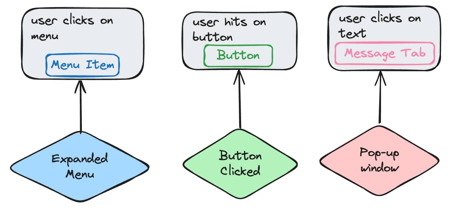
I believe giving feedback is both polite and essential for good UI practice. I make sure my system responds meaningfully. For example:
- Clicks on a menu
- Hits a button
- Clicks on a text message tab

I use specific UI elements like animations, progress bars, pop-up windows, or colour changes to show users if their action was successful. This helps them know if what they did worked and improves their overall experience.
5) Set Expectations
Interacting with our app can lead to important outcomes, which might make users feel anxious. To ease this, I make sure users know what will happen when they click a button, using clear design and copy. Here’s how:
- Setting expectations with design:
- Highlight the button for the desired action.
- Use familiar symbols (like a trash can for delete or a magnifying glass for search) along with text.
- Choose colours that convey meaning (green for “go,” red for “stop”).
- Setting expectations with copy:
- Write clear button text.
- Provide helpful text in empty states.
- Deliver warnings and ask for confirmation for actions with serious consequences, like permanent deletion.
- This helps users feel confident and informed about their actions.
6) Easy to learn
People can only hold 5 to 9 pieces of information in their short-term memory, so I make sure my UI design avoids overwhelming users with too many choices. My main goal is to keep the interface clean and simple by displaying only the most essential features initially.
Less frequently used options can be hidden until the user needs them. Unclear link text can confuse users, so instead of using ambiguous links like “learn more,” I prefer descriptive text that communicates what the link leads to. For example, instead of “learn more,” a link could say “Read about our privacy policy” or “See detailed product specifications.”
7) Anticipate Mistakes
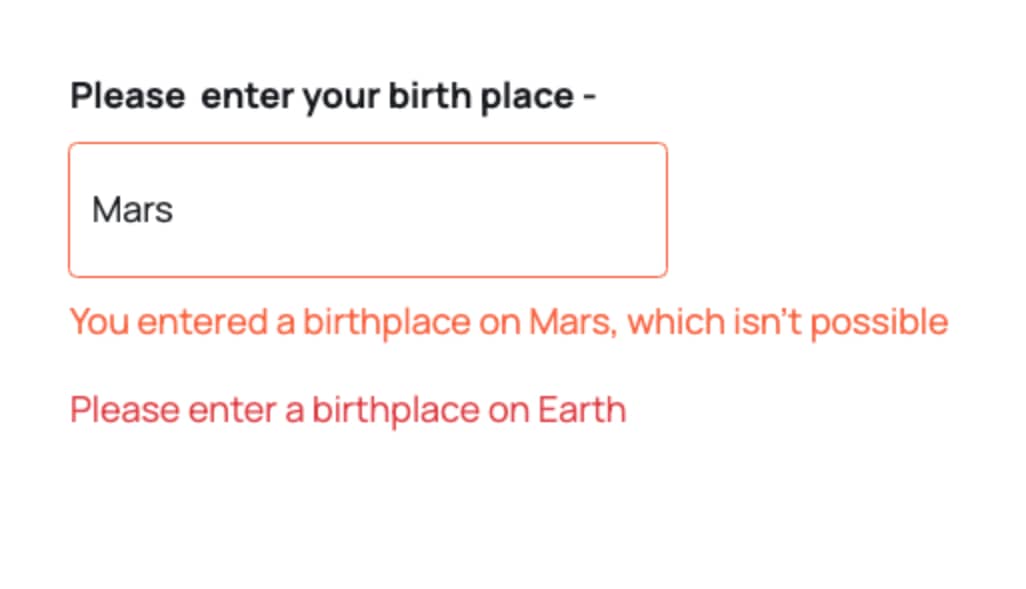
Designing our UI to prevent errors is crucial, but we also need to be ready for any mistakes users might make. That’s why it’s important to include helpful messages that guide users in resolving issues and completing their tasks successfully.
For example, alongside an error message, we should provide clear instructions on how to fix the problem and quickly resolve it. This way, we ensure a smoother and more user-friendly experience.

8) Use Recognition rather than Recall
When users visit a website, they bring expectations based on their experiences with other sites and apps. If your design elements are unfamiliar or confusing, users won’t feel engaged.
That’s why I use familiar design elements like shopping cart icons, notification bells, and hamburger menus, placing them in common spots, such as the top left or right corners of the page.
9) Make Actions Reversible
Put the user in control of the UI by making actions reversible. Allow users to:
- Unselect items they’ve chosen
- Undo their last actions
- Restart any processes they’ve started
This approach helps users feel more in control and reduces frustration from mistakes, which delivers a smoother experience.
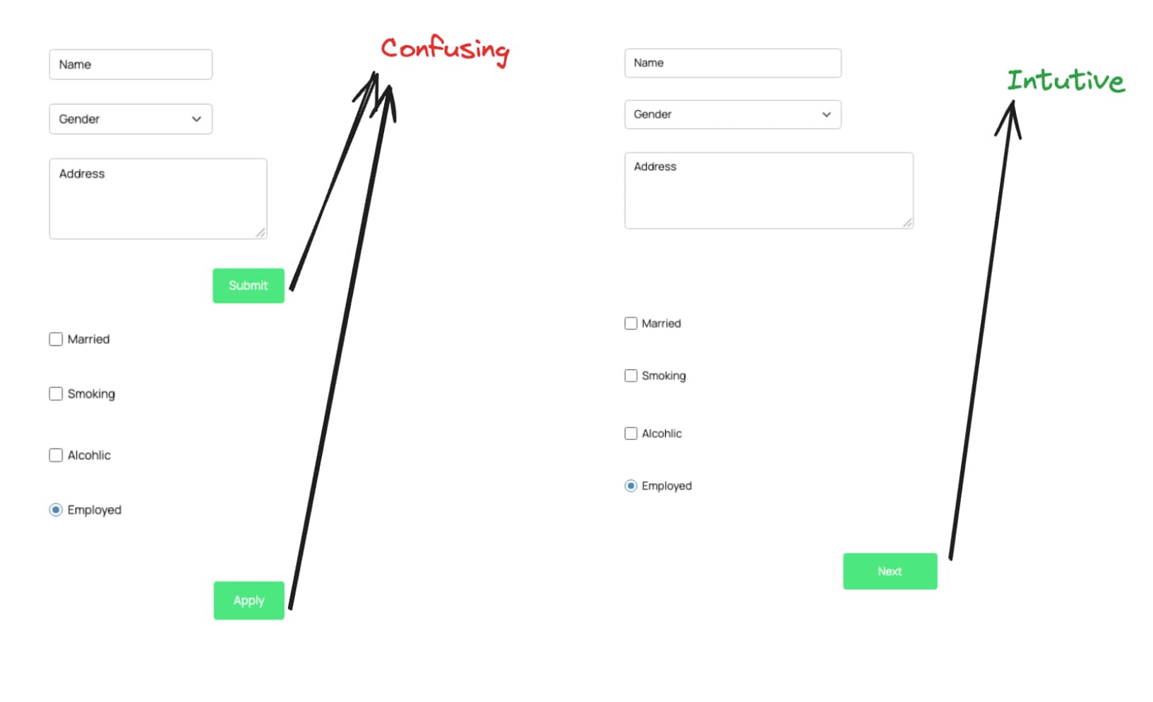
10) Stick to one primary action per screen
Ensure that each screen focuses on just one main action. Trying to fit too much information or asking users to perform multiple primary actions at once will:
- Confuse them
- Distract them
- Overload their attention
Keeping screens simple helps users stay focused and makes their tasks easier to complete.

Conclusion
In the end, great UI design is about making things simpler and more enjoyable for users by following these simple rules, I aim to create interfaces that are not only functional but also intuitive and engaging. Each design choice, from colour use to feedback mechanisms, plays a part in crafting a seamless experience. You can now check some of the best Tools For Front-End Developers.


