


Pandas library in Python provides a lot of tools required for our analysis. In data analysis and visualization, a scatter plot is a powerful tool to understand the relationship between two numbers or variables. A scatter plot allows us to represent each data point and identify patterns, correlations, and outliers in the data. In this article, we will explore how to create a scatter plot using the popular Python library, Pandas.
What is the plot.scatter() in Pandas?
A scatter plot is a method to display data that shows the relationship between two numerical variables. Each dot on the scatter plot can represent a single data point, with the x-axis representing one variable and the y-axis representing the other variable. By plotting the data points on a graph, we can visually analyse the relationship between the two variables.
The plot.scatter() method in Pandas allows us to make scatter for our data visualisation needs.
Following is the syntax of the plot.scatter():
DataFrame.plot.scatter(x, y, s=None, c=None, **kwargs)Parameters:
- x: The column name or position to be used as the horizontal coordinates for each point.
- y: The column name or position to be used as the vertical coordinates for each point.
- s: The size of each point. It can be a single scalar, a string with the name of the column to be used for marker size, or a sequence of scalars.
- c: The colour of each point. It can be a single colour string, a sequence of colour strings, or a column name or position whose values will be used to colour the marker points according to a colourmap.
- **kwargs: Additional keyword arguments to pass on to the underlying plotting function.
Now, let us look at how to use the method to draw scatter plots of our data.
Creating a Scatter Plot from a DataFrame
We can simply use a DataFrame and then apply plot.scatter. To create a scatter plot from the DataFrame, we can use the plot.scatter() function and specify the ‘x’ and ‘y’ columns.
Let us look at an example:
import pandas as pd

# Create DataFrame
df = pd.DataFrame({'A': [1, 2, 3, 4, 5], 'B': [2, 4, 6, 8, 10]})

# Display the DataFrame
print('Original DataFrame:\n', df)

# Create scatter plot
df.plot.scatter(x='A', y='B')
Output:
Original DataFrame:
    A   B
0  1   2
1  2   4
2  3   6
3  4   8
4  5  10

Customising our Scatter Plot
We can also customise our scatter to meet our needs. Pandas provide various options to customize the appearance of the scatter plot. We can modify the size, colour, and other properties of the data points to improve the visualization.
Let us first see how to modify the size of the dots. To provide customised sizes for each dot, we can pass a sequence of scalars with the sizes. A sequence of scalars is similar to a list of integers.
See the Python code below:
import pandas as pd

# Create DataFrame
df = pd.DataFrame({'A': [1, 2, 3, 4, 5], 'B': [2, 4, 6, 8, 10]})

# Display the DataFrame
print('Original DataFrame:\n', df)

# Create scatter plot with customized size
df.plot.scatter(x='A', y='B', s=[50, 100, 150, 200, 250])
Output:
Original DataFrame:
    A   B
0  1   2
1  2   4
2  3   6
3  4   8
4  5  10

In the above example, we assigned different sizes to every dot based on a sequence of scalars [50, 100, 150, 200, 250]. The first dot will have a size of 50, the second dot will have a size of 100, and so on.
Now, let us learn how to change the colour of the dots:
import pandas as pd

# Create DataFrame
df = pd.DataFrame({'A': [1, 2, 3, 4, 5], 'B': [2, 4, 6, 8, 10]})

# Display the DataFrame
print('Original DataFrame:\n', df)

# Create scatter plot with customized color
df.plot.scatter(x='A', y='B', c='red')
Output:
Original DataFrame:
    A   B
0  1   2
1  2   4
2  3   6
3  4   8
4  5  10
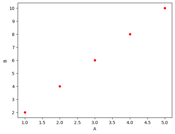
We can define various colours in the ‘c’ parameter of the plot.scatter method. In the example, we defined our scatter points to be red.
Using Matplotlib to Create Scatter Plots
We can also use the traditional library for plotting graphs, matplotlib to plot scatter plots.
Matplotlib is a powerful library for data visualization and provides extensive customization options.
Let us look at an example of how to draw a scatter plot using matplotlib:
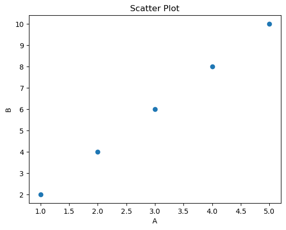
import matplotlib.pyplot as plt
import pandas as pd

# Create DataFrame
df = pd.DataFrame({'A': [1, 2, 3, 4, 5], 'B': [2, 4, 6, 8, 10]})

# Display the DataFrame
print('Original DataFrame:\n', df)

# Create scatter plot using Matplotlib
plt.scatter(df['A'], df['B'])
plt.xlabel('A')
plt.ylabel('B')
plt.title('Scatter Plot')
plt.show()
Output:
Original DataFrame:
    A   B
0  1   2
1  2   4
2  3   6
3  4   8
4  5  10
You can learn about other Python libraries for Data Science as well.
Conclusion
In this article, we learned how to create scatter plots using the Pandas library in Python. Scatter plots are a powerful tool for seeing the relationship between two numerical variables in a DataFrame. We learned about the syntax and parameters of the plot.scatter() function and saw examples of creating basic scatter plots as well as customizing the size and colour of the dots.